

Redefine Fit: Website Redesign
Redefine Fit: Website Redesign
Redefine Fit: Website Redesign
Health • Fitness
Health • Fitness
How I resolved responsive usability issues on a pole fitness website with limited resources, leading to a 25% increase in customer sign-ups.
How I resolved responsive usability issues on a pole fitness website with limited resources, leading to a 25% increase in customer sign-ups.
Role
Role
Role
UX Designer
UX Designer
UX Designer
Client
Client
Client
Redefine Fit
Redefine Fit
Redefine Fit
Duration
Duration
Duration
6 months
6 months
6 months
What was the main challenge?
What was the main challenge?
The outdated Redefine Fit WordPress website breaks on mobile screens, making it hard to attract new clients. It hadn't been updated in 8 years and needed a quick redesign for a summer event within a limited budget and specific developer preferences.
How was it resolved?
How was it resolved?
I redesigned the Redefine Fit website using the Flowbite component library to save time and ensure accessibility. The new site has attracted 25% more customer sign-ups.
25%
25%
25%
increase in new customer sign-ups because 30+ usability issues were resolved
increase in new customer sign-ups because 30+ usability issues were resolved
10 hrs
saved per week in combined design and development work
saved per week in combined design and development work
40%
40%
40%
decrease in weekly repetitive customer email inquiries
decrease in weekly repetitive customer email inquiries

Project Storyline (a.k.a. a table of contents)
Project Storyline (a.k.a. a table of contents)

Epilogue: Learnings
Epilogue: Learnings

Chapter 01: Website Audit
Chapter 01: Website Audit
Chapter 01: Website Audit


Uncovering usability issues and broken experiences
Uncovering usability issues and broken experiences
Uncovering usability issues and broken experiences
Revamping a broken website to boost student interest under tight constraints
Revamping a broken website to boost student interest under tight constraints
Redefine Fit, a pole fitness studio with 8 years of loyal clientele and active social media, opened a new location, but sign-ups were low. We believed the outdated, non-mobile-responsive website was the issue. I was initially asked to make the WordPress site mobile-friendly, but we decided on a complete redesign.
Redefine Fit, a pole fitness studio with 8 years of loyal clientele and active social media, opened a new location, but sign-ups were low. We believed the outdated, non-mobile-responsive website was the issue. I was initially asked to make the WordPress site mobile-friendly, but we decided on a complete redesign.
To attract new clients, I redesigned the website on WordPress under these constraints:
To attract new clients, I redesigned the website on WordPress under these constraints:

Time: We planned to promote the studio at summer street festivals and wanted the new website ready for potential clients to check out by then.
Time: We planned to promote the studio at summer street festivals and wanted the new website ready for potential clients to check out by then.

Budget: Instead of switching to Framer, as I initially suggested, the client chose to stay on WordPress because they were familiar with it and had recently renewed their subscription for another two years.
Budget: Instead of switching to Framer, as I initially suggested, the client chose to stay on WordPress because they were familiar with it and had recently renewed their subscription for another two years.

Resources: The developer and I kept the WordPress site as a headless CMS to allow the new responsive React app to pull content from it. To save effort, I used a React-friendly, open-source component library and integrated the limited brand assets available, ensuring they matched Redefine Fit’s online presence and in-studio look.
Resources: The developer and I kept the WordPress site as a headless CMS to allow the new responsive React app to pull content from it. To save effort, I used a React-friendly, open-source component library and integrated the limited brand assets available, ensuring they matched Redefine Fit’s online presence and in-studio look.
Website audit reveals broken links, non-responsive pages, and confusing layouts
Website audit reveals broken links, non-responsive pages, and confusing layouts
I started with a website audit to understand how all the pages connect and to identify any issues. This helped me get familiar with the site and its structure.
I started with a website audit to understand how all the pages connect and to identify any issues. This helped me get familiar with the site and its structure.
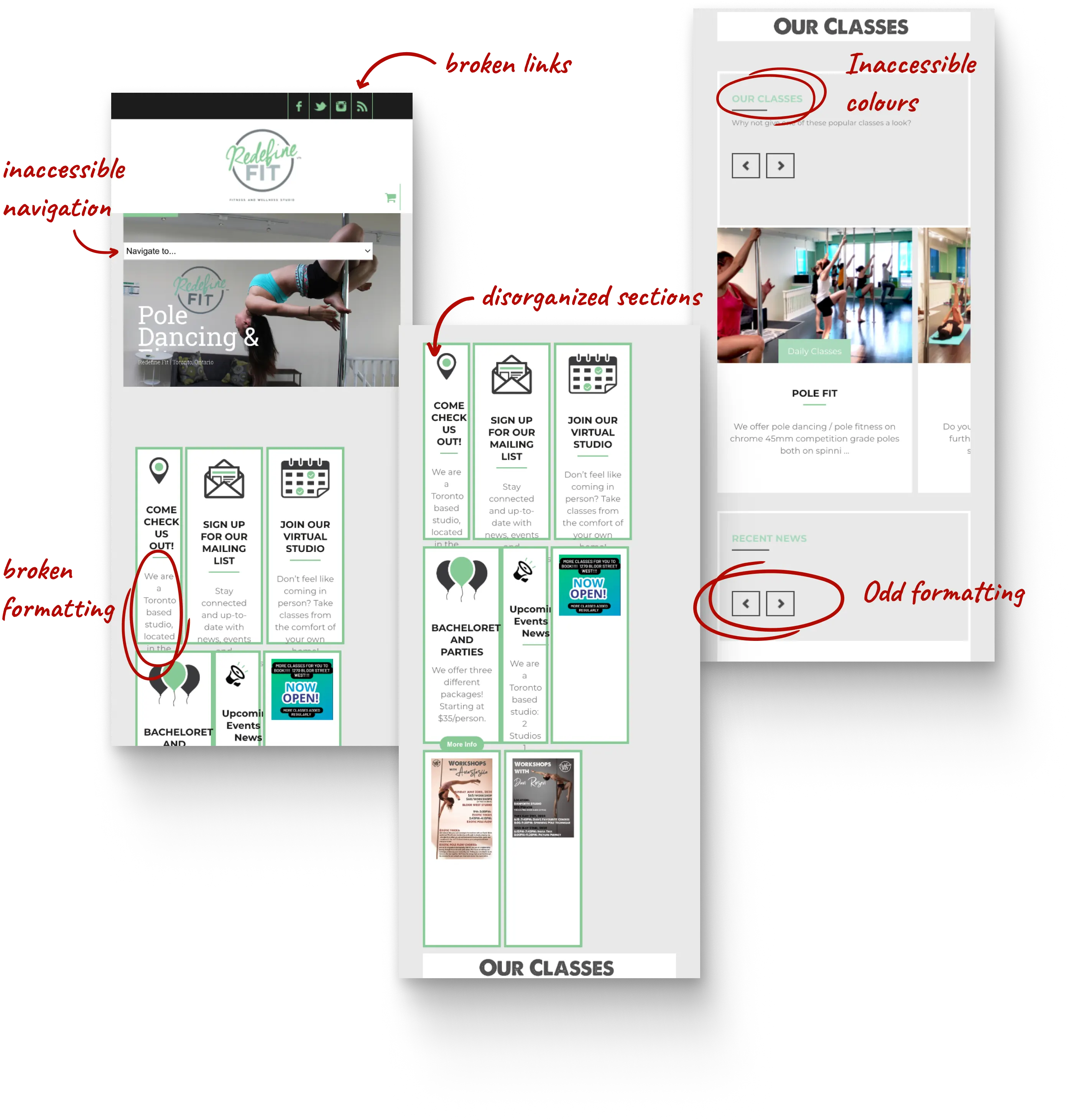
Landing page: Broken links, missing information, and non-responsive layouts
Landing page: Broken links, missing information, and non-responsive layouts
01
01
Top navigation links are broken
Top navigation links are broken
02
02
Missing information about the newly opened second studio
Missing information about the newly opened second studio
03
03
Layout breaks when the screen resizes
Layout breaks when the screen resizes
04
04
Too much content crammed into one section
Too much content crammed into one section


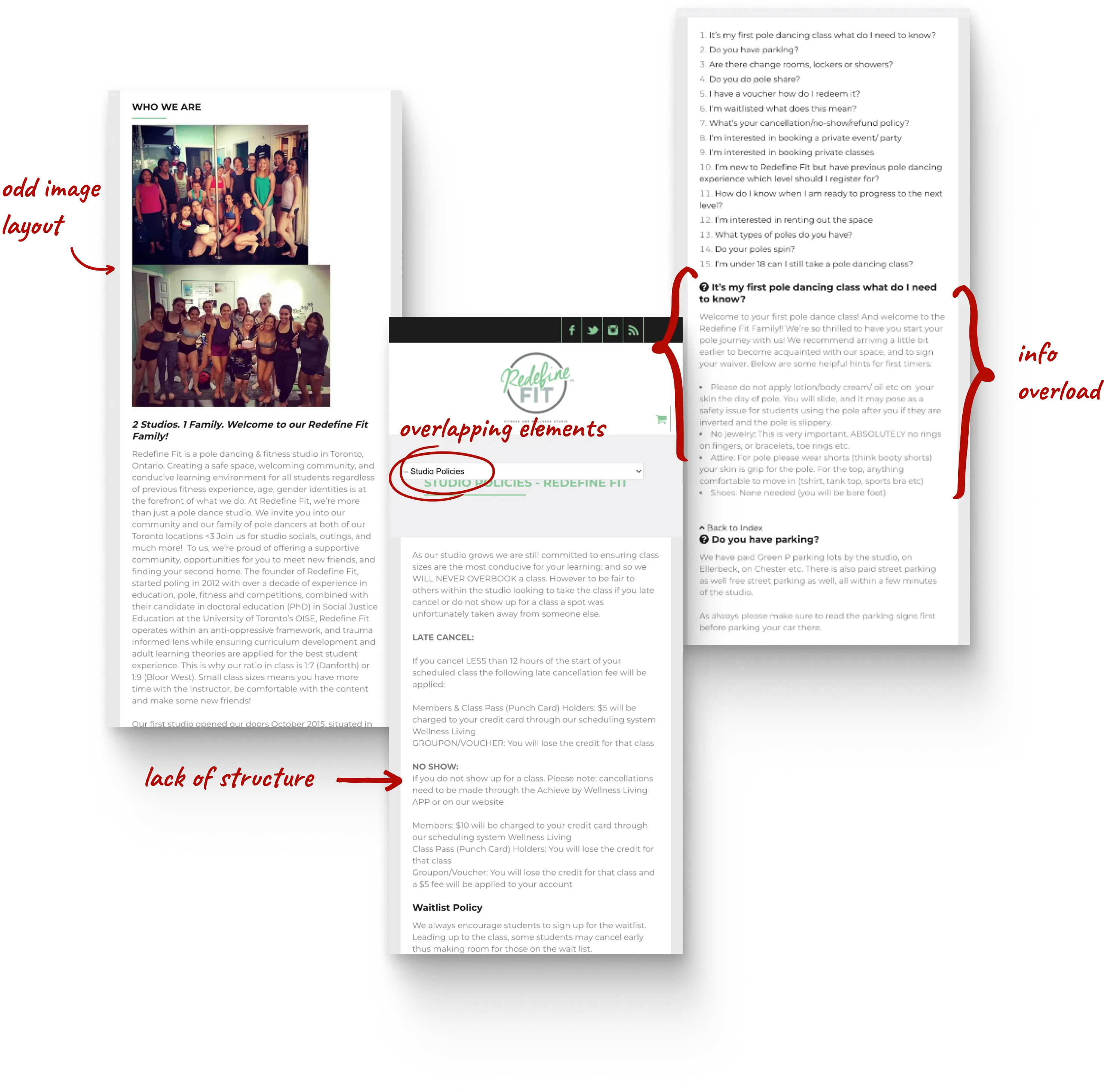


About section: Poor information hierarchy, excessive content, and non-responsive layouts
About section: Poor information hierarchy, excessive content, and non-responsive layouts
01
01
Images don't resize properly on smaller screens
Images don't resize properly on smaller screens
02
02
Poor information hierarchy makes content hard to scan
Poor information hierarchy makes content hard to scan
03
03
Excessive written content is overwhelming
Excessive written content is overwhelming
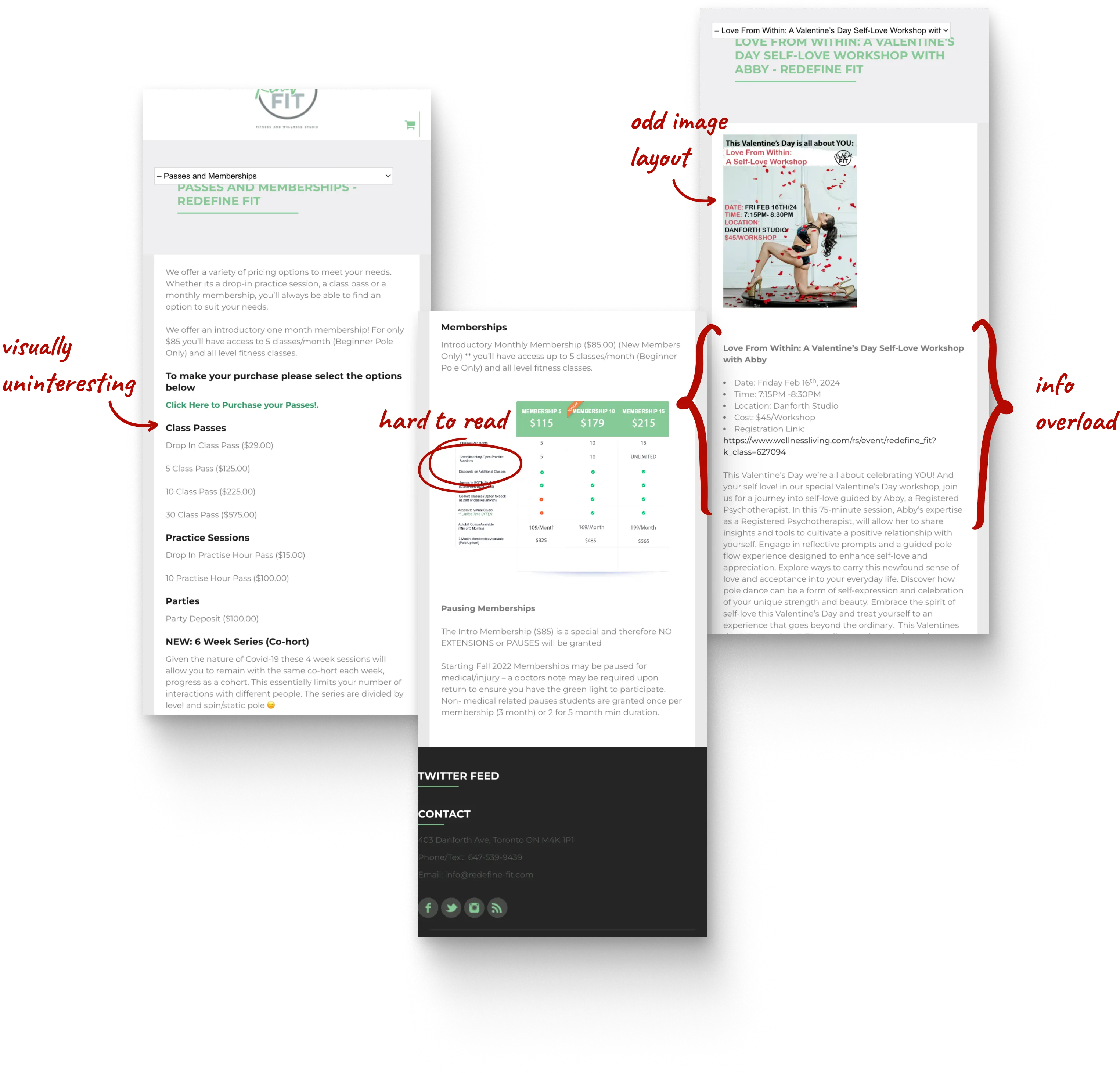
Classes and Schedule section: Lack of information hierarchy, missing details, and non-responsive layouts
Classes and Schedule section: Lack of information hierarchy, missing details, and non-responsive layouts
01
01
Images don't resize properly on smaller screens
Images don't resize properly on smaller screens
02
02
Lack of information hierarchy makes content hard to scan
Lack of information hierarchy makes content hard to scan
03
03
Outdated pricing and class information
Outdated pricing and class information


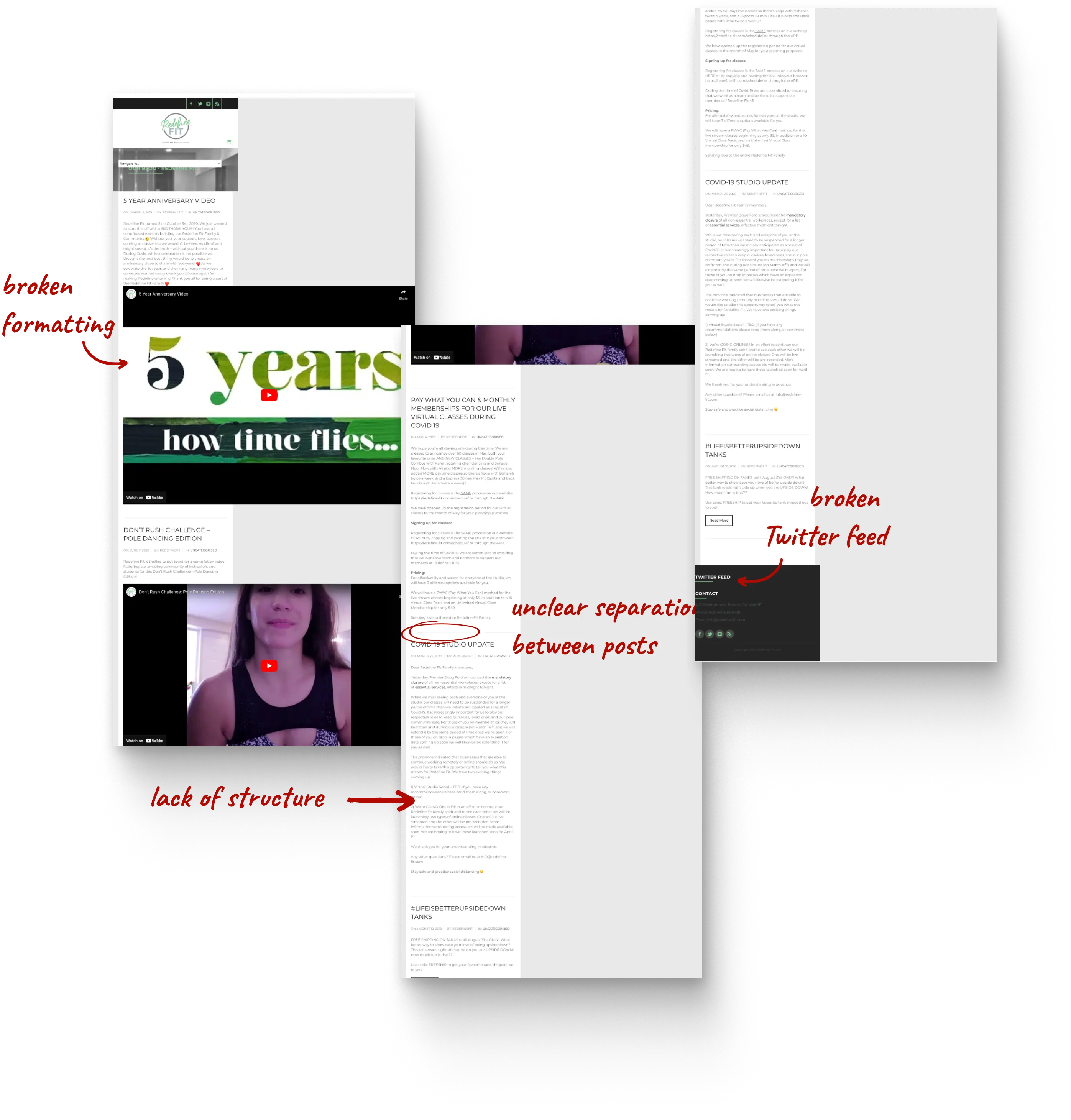


Blog section: Poor information hierarchy, and non-responsive layouts
Blog section: Poor information hierarchy, and non-responsive layouts
01
01
Images and videos don't resize properly on smaller screens
Images and videos don't resize properly on smaller screens
02
02
Poor information hierarchy makes content hard to scan
Poor information hierarchy makes content hard to scan

Chapter 02: Research Into Student Loyalty
Chapter 02: Research Into Student Loyalty
Chapter 02: Research Into Student Loyalty


Uncovering insights into Toronto's pole fitness and dance community
Uncovering insights into Toronto's pole fitness and dance community
Uncovering insights into Toronto's pole fitness and dance community
Redefine Fit stands out for its diversity in pole fitness classes
Redefine Fit stands out for its diversity in pole fitness classes
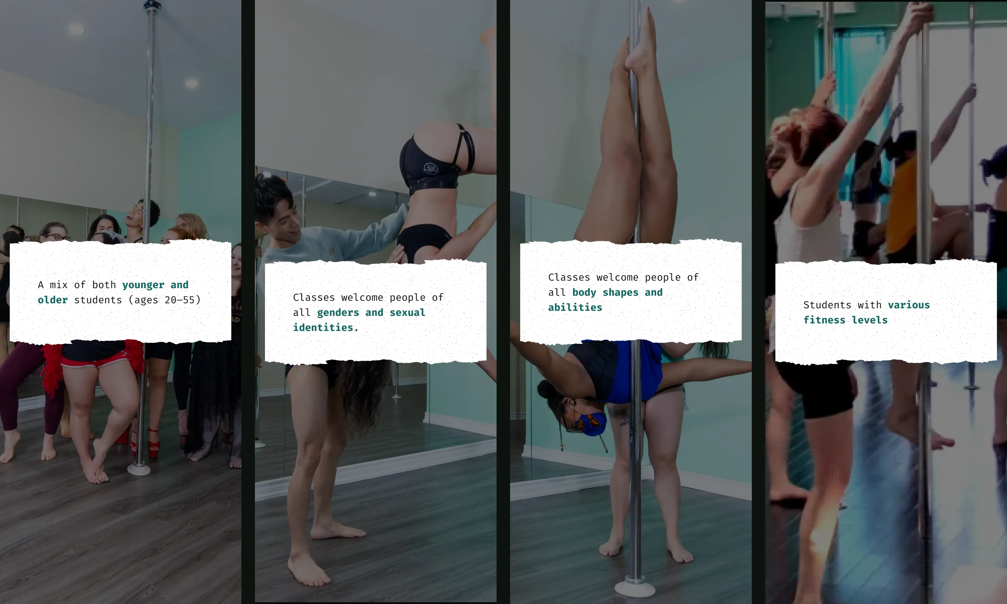
Students love Redefine Fit because of its teaching style, inclusive community, and confidence boost
Students love Redefine Fit because of its teaching style, inclusive community, and confidence boost
I wanted to know why students keep coming back to Redefine Fit. Through casual conversations with new and old students, I learned their personal reasons. I used this information to inspire the website redesign.
I wanted to know why students keep coming back to Redefine Fit. Through casual conversations with new and old students, I learned their personal reasons. I used this information to inspire the website redesign.
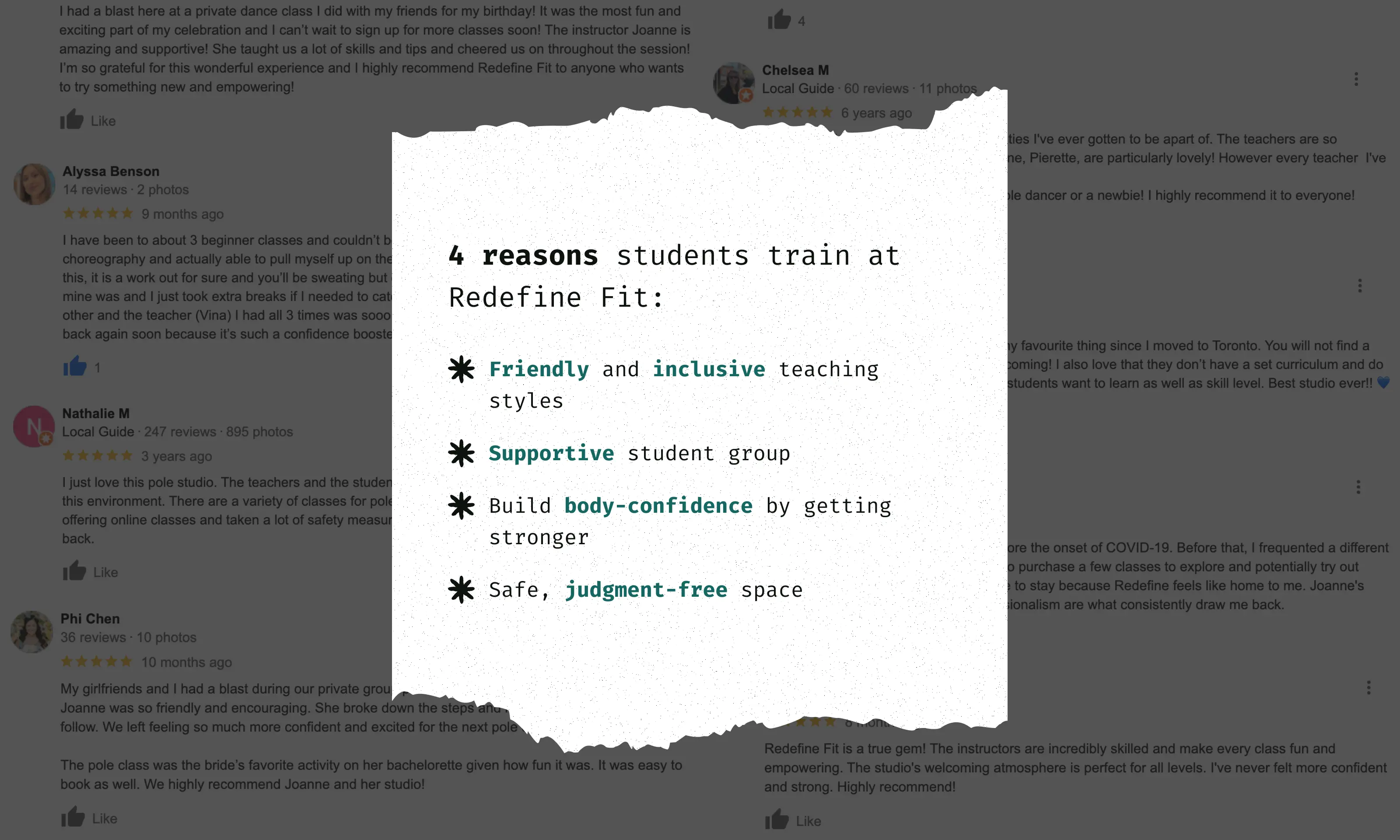
The North American pole fitness and dance scene: Limiting body types and sensual styles
The North American pole fitness and dance scene: Limiting body types and sensual styles
For inspiration, I reviewed other Toronto pole fitness and dance studio websites. While their designs fit their target clientele, they didn’t align with the values of Redefine Fit or its community. I wanted to focus on strength and fitness as the core message.
For inspiration, I reviewed other Toronto pole fitness and dance studio websites. While their designs fit their target clientele, they didn’t align with the values of Redefine Fit or its community. I wanted to focus on strength and fitness as the core message.
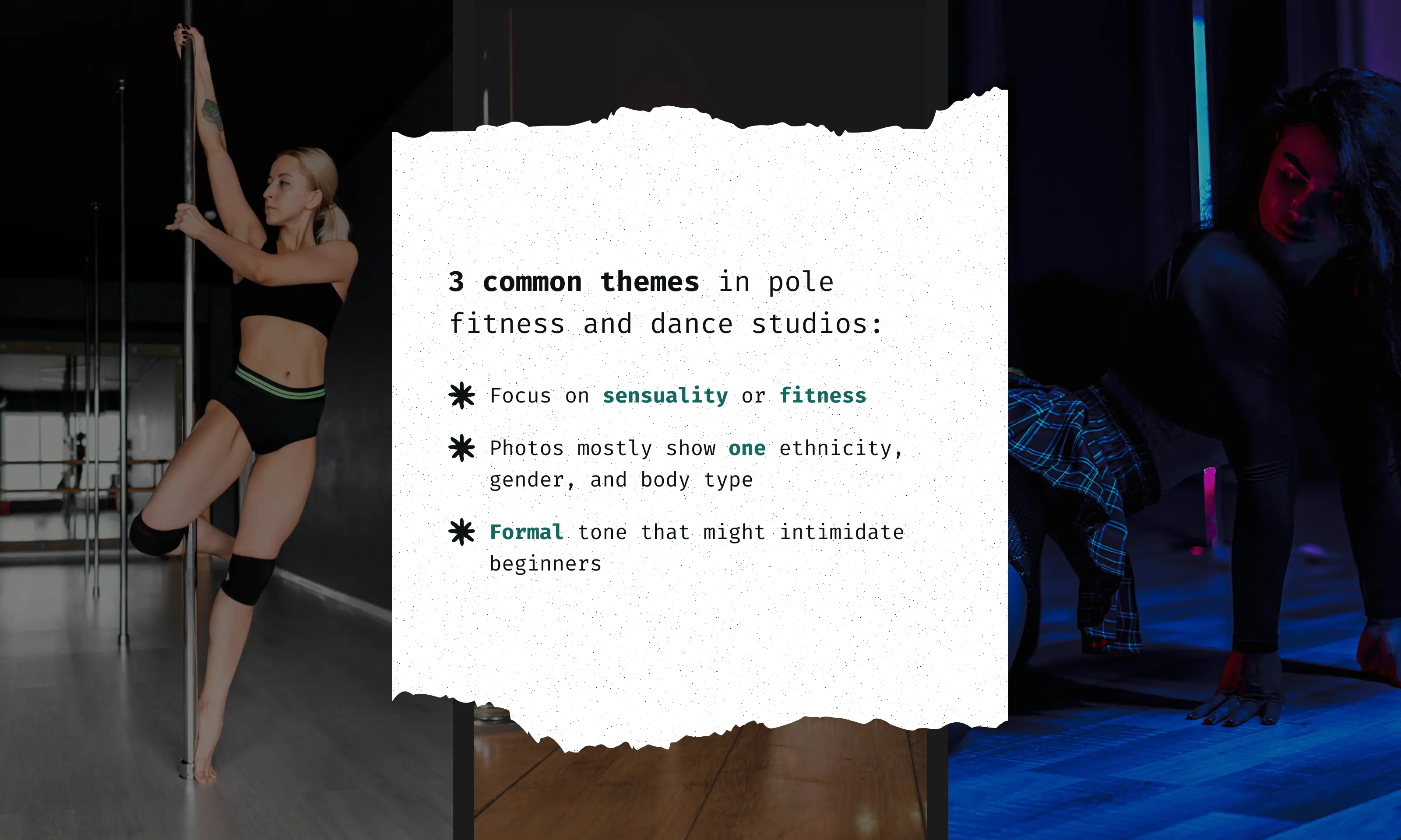
Inspiration from woman-owned fitness studios: Diverse clients, unique colors, and friendly communication
Inspiration from woman-owned fitness studios: Diverse clients, unique colors, and friendly communication
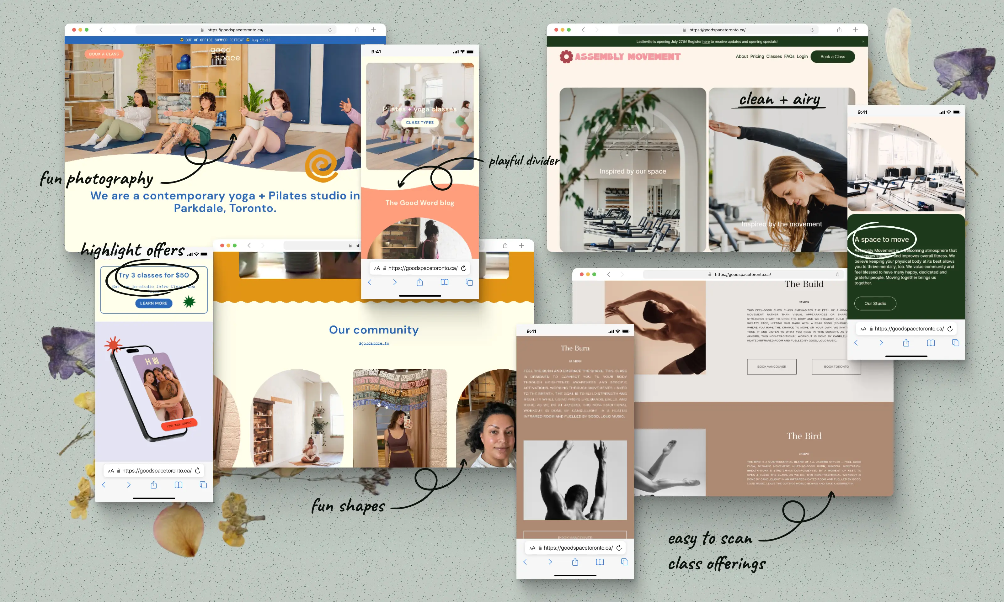
I looked at the websites of other woman-owned boutique fitness studios, including dance, yoga, and pilates. I was inspired because they featured diverse groups of people, used colors beyond the usual pink for female-identifying spaces, and had a friendly yet inspiring writing tone.
I looked at the websites of other woman-owned boutique fitness studios, including dance, yoga, and pilates. I was inspired because they featured diverse groups of people, used colors beyond the usual pink for female-identifying spaces, and had a friendly yet inspiring writing tone.

Chapter 03: Improvement Prioritization
Chapter 03: Improvement Prioritization
Chapter 03: Improvement Prioritization


Reviewing current designs to identify impactful improvements
Reviewing current designs to identify impactful improvements
Reviewing current designs to identify impactful improvements
Reviewing the information architecture for outdated pages and irrelevant COVID content
Reviewing the information architecture for outdated pages and irrelevant COVID content
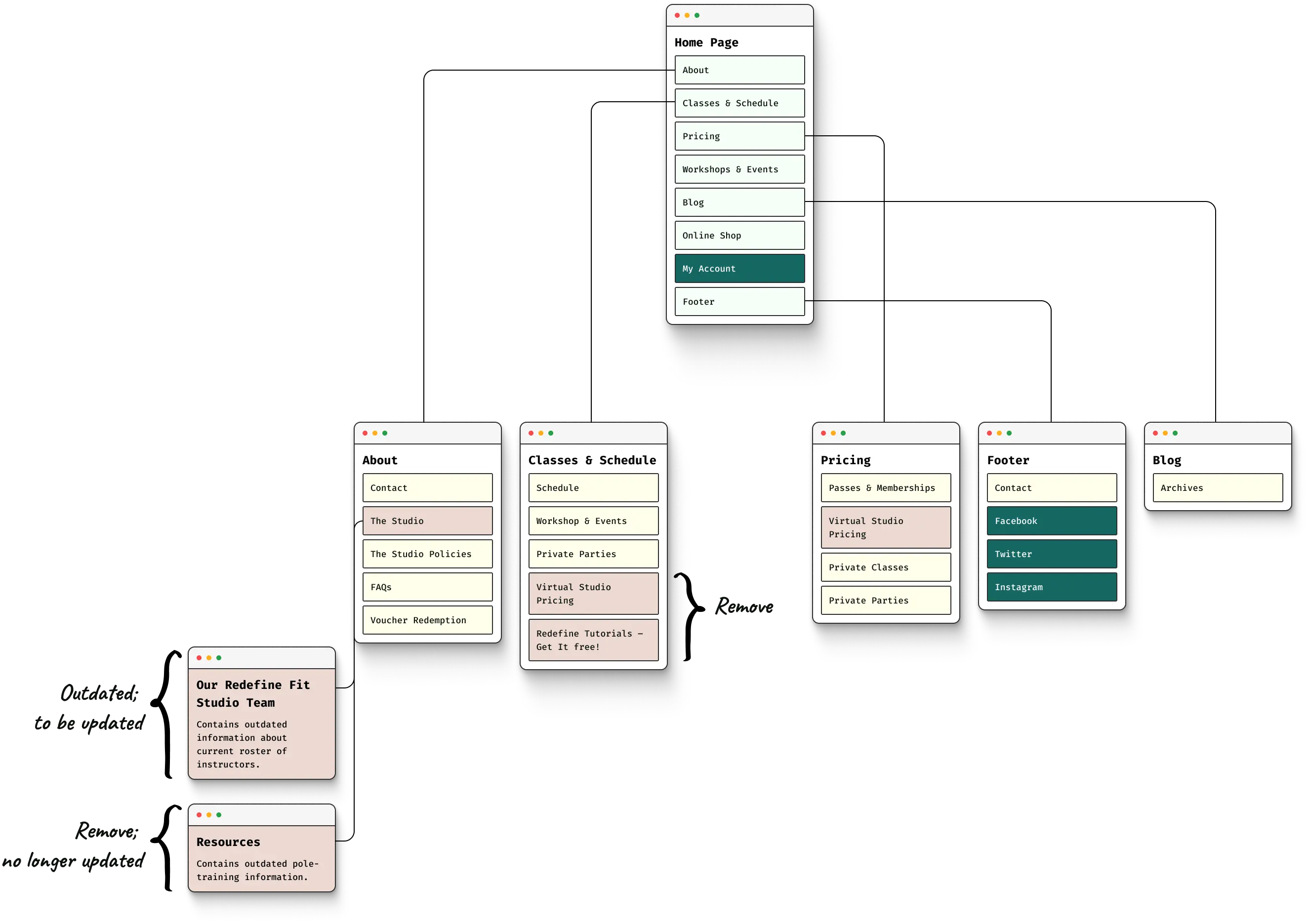
The studio owner and I decided which pages to keep or remove. Since the pandemic is over, we took down the virtual class studio and outdated at-home training resources.
The studio owner and I decided which pages to keep or remove. Since the pandemic is over, we took down the virtual class studio and outdated at-home training resources.




Changes: Updated hierarchy, removed outdated pages, and added new ones
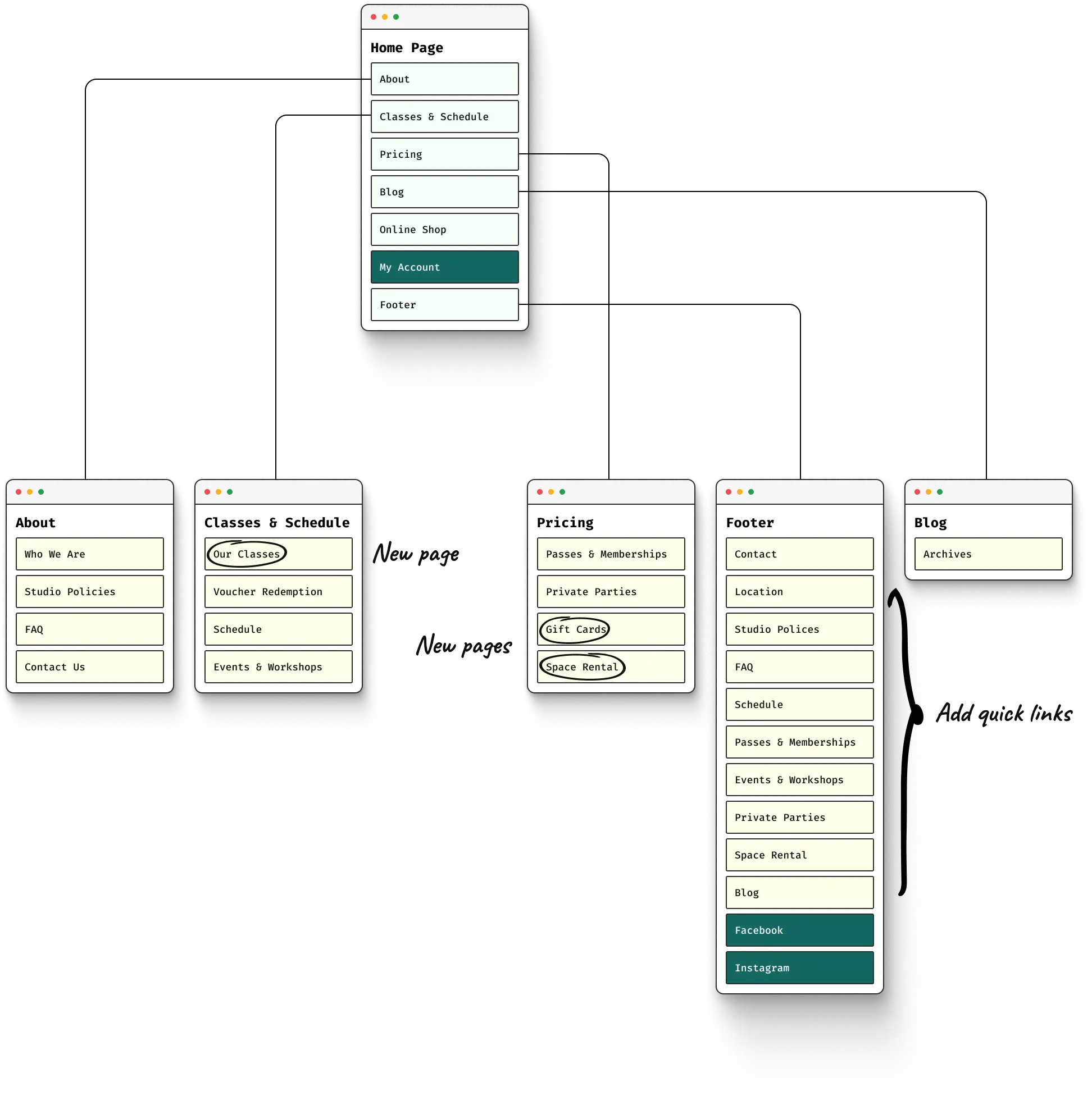
Changes: Updated hierarchy, removed outdated pages, and added new ones
01
01
Added new page for current classes, space rentals, and gift cards
Added new page for current classes, space rentals, and gift cards
02
02
Moved "Voucher Redemption" page to the Classes & Schedule section
Moved "Voucher Redemption" page to the Classes & Schedule section
03
03
Shifted "Events & Workshops" page to the Classes & Schedule schedule
Shifted "Events & Workshops" page to the Classes & Schedule schedule

Redefine Fit brand values
Redefine Fit brand values
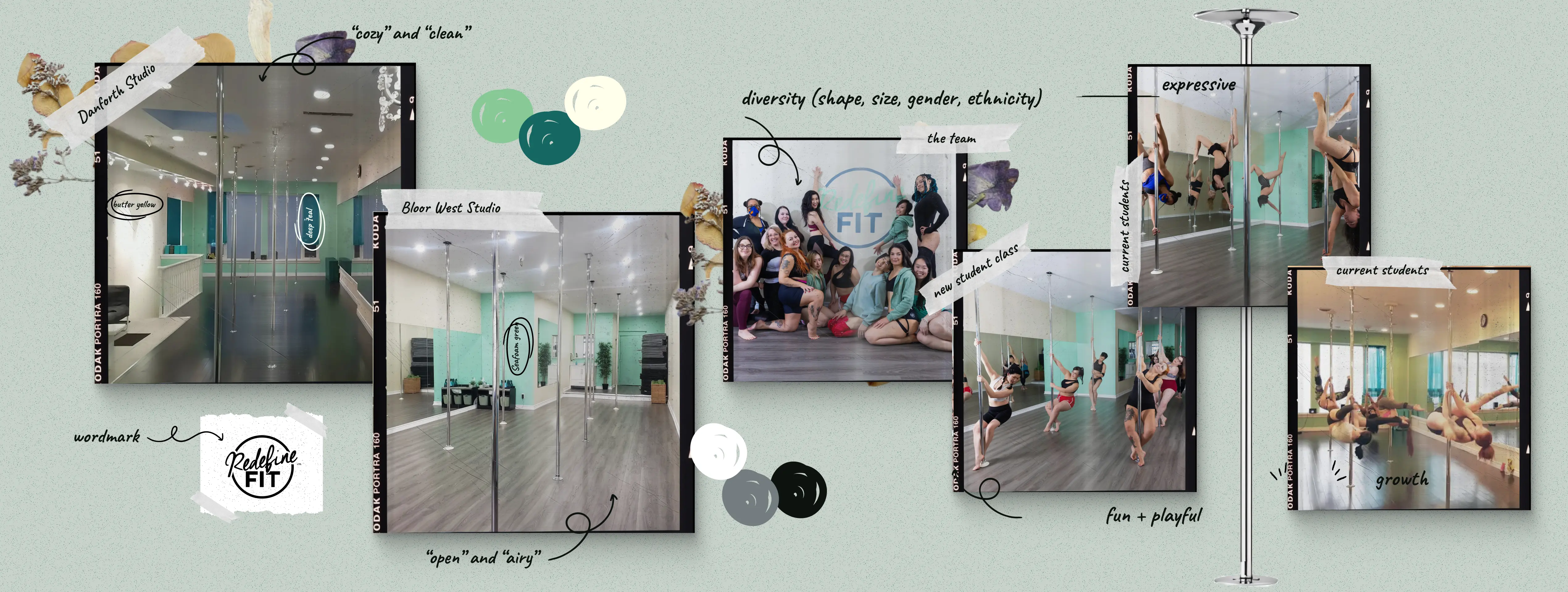
Although I didn't have contact with the original designer, I worked with the owner to pinpoint the studio's key values based on research about the student community.
01
01
Diverse and Inclusive
Diverse and Inclusive
Use photos that highlight a variety of different body types, ages, gender and sexual identities, and ethnic backgrounds
Use photos that highlight a variety of different body types, ages, gender and sexual identities, and ethnic backgrounds
02
02
Approachable and Fun
Approachable and Fun
Use light colours and clean, bold type, ‘playful’ elements, and friendly and energetic writing tone
Use light colours and clean, bold type, ‘playful’ elements, and friendly and energetic writing tone
03
03
Expressive and Open
Expressive and Open
Use photos of people smiling and enjoying free-flowing movement. Make use of a lot of white space, and avoid designs that feel contained
Use photos of people smiling and enjoying free-flowing movement. Make use of a lot of white space, and avoid designs that feel contained
Speeding up design and development with a React-friendly and accessible component library
Speeding up design and development with a React-friendly and accessible component library
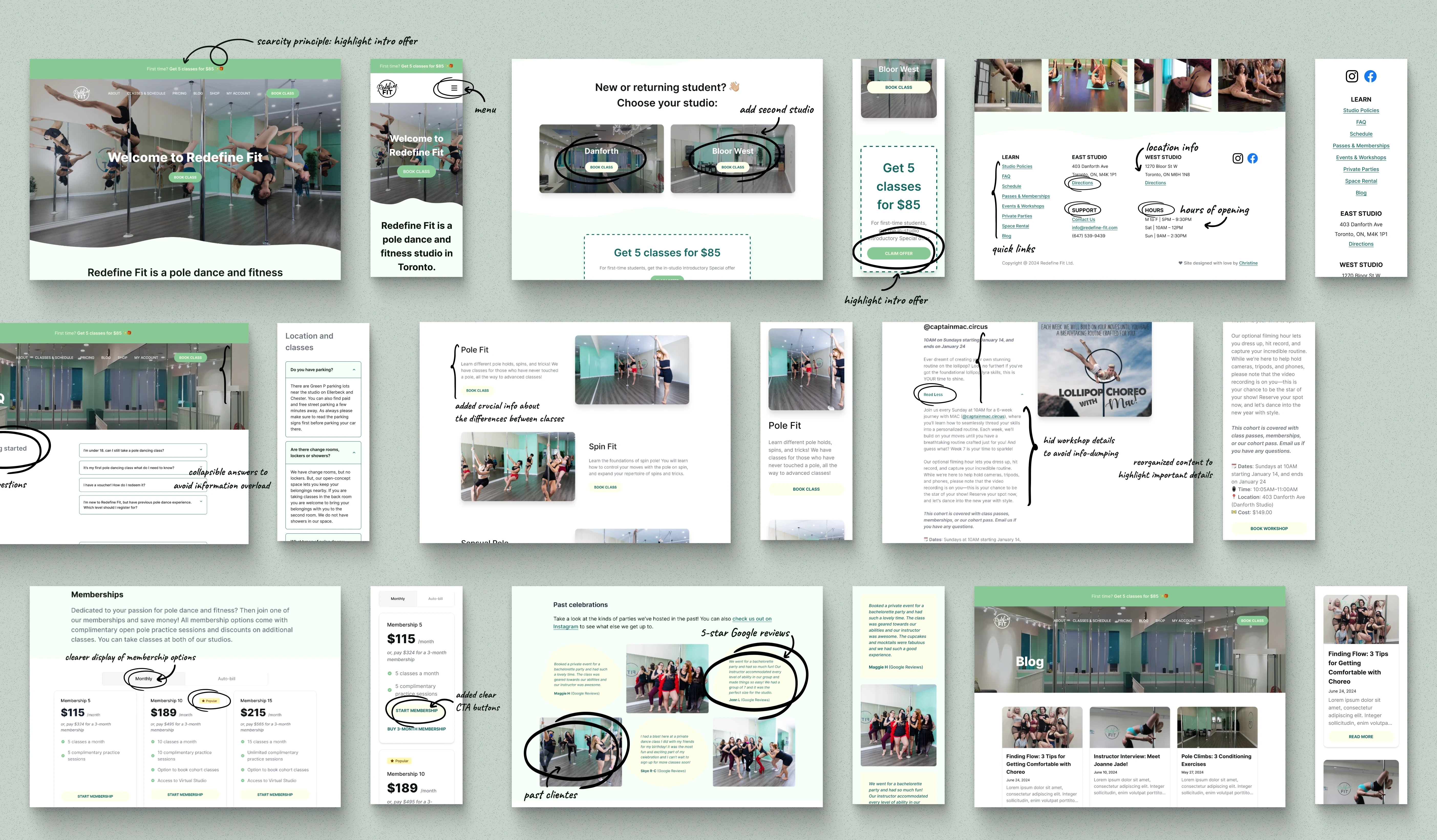
Given the time and budget constraints, I had wanted to use a design library to speed up both design and development time. I chose Flowbite for the following reasons:
Given the time and budget constraints, I had wanted to use a design library to speed up both design and development time. I chose Flowbite for the following reasons:
01
01
It’s an open-source library with a Figma file containing over 600 UI components, sections, and pages built using Tailwind CSS utility classes
It’s an open-source library with a Figma file containing over 600 UI components, sections, and pages built using Tailwind CSS utility classes
02
02
It works with many technology frameworks, including React, which the developer is familiar with
It works with many technology frameworks, including React, which the developer is familiar with
03
03
It's popular in the design and development community for its ease of implementation
It's popular in the design and development community for its ease of implementation
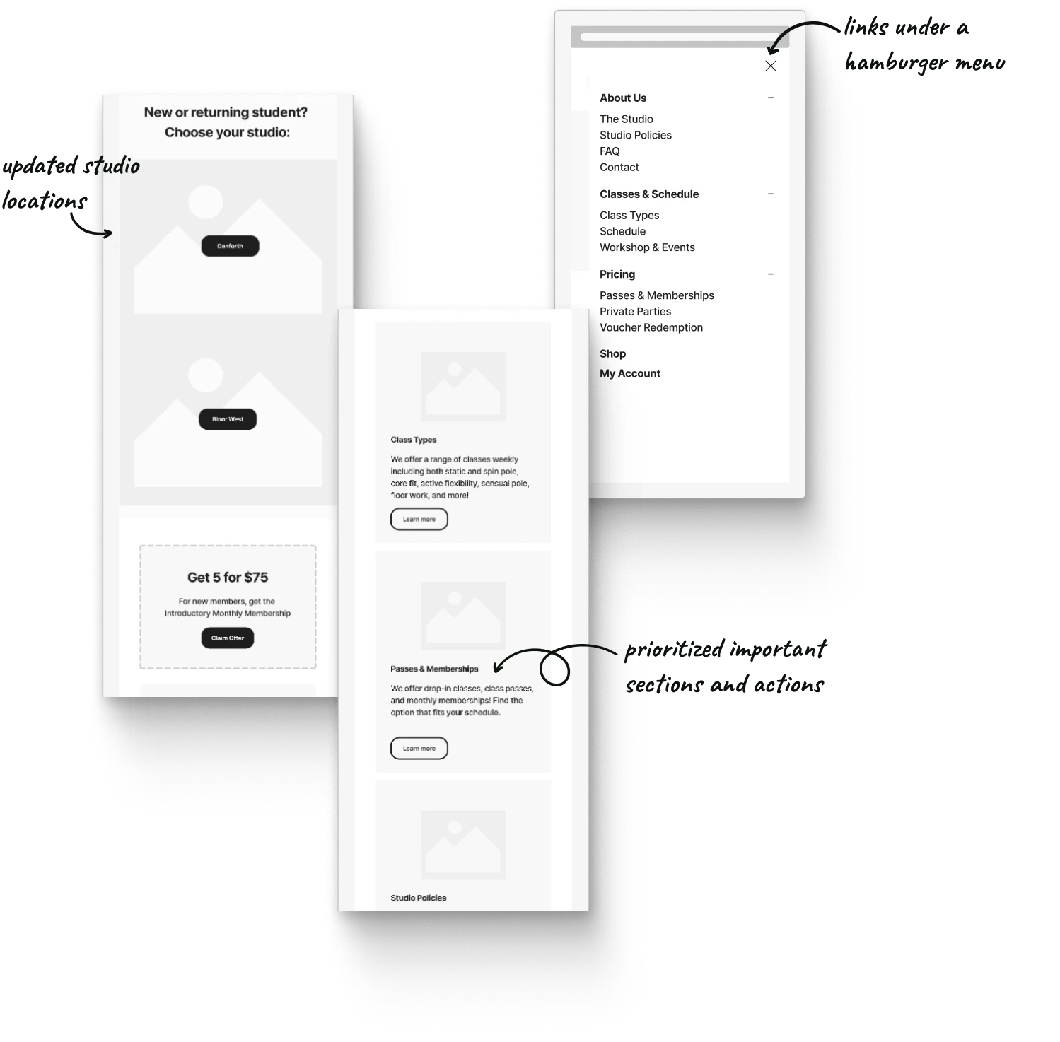
Landing page: Usability fixes and improvements
Landing page: Usability fixes and improvements
01
01
Reorganized links under a menu for better navigation
Reorganized links under a menu for better navigation
02
02
Added second studio location
Added second studio location
03
03
Adjusted layout for content resizing
Adjusted layout for content resizing
04
04
Created sections to highlight important actions or commonly visited pages
Created sections to highlight important actions or commonly visited pages


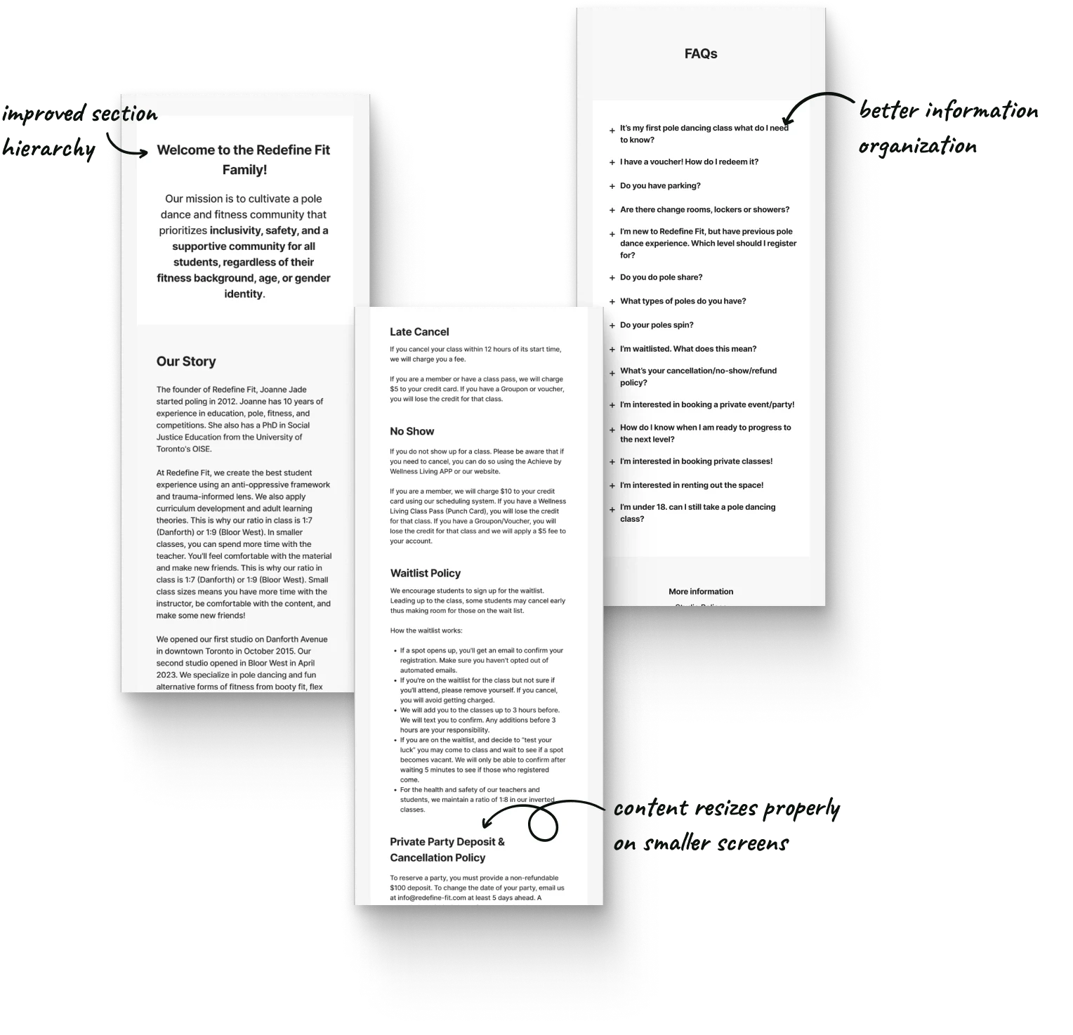


About section improvements: Who We Are, The Studio Policies, and FAQs pages
About section improvements: Who We Are, The Studio Policies, and FAQs pages
01
01
Adjusted image layout for resizing
Adjusted image layout for resizing
02
02
Improved page title for accessibility
Improved page title for accessibility
03
03
Added structure to organize information better
Added structure to organize information better
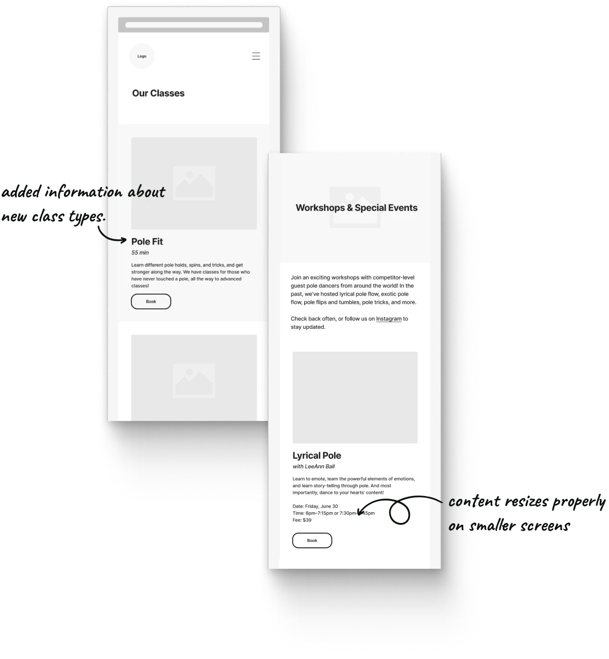
Classes & Schedule section improvements: Our Classes, and Events and Workshop pages
Classes & Schedule section improvements: Our Classes, and Events and Workshop pages
01
01
Added new information about class offerings
Added new information about class offerings
02
02
Adjusted layout for image resizing
Adjusted layout for image resizing
03
03
Added structure to organize information better
Added structure to organize information better


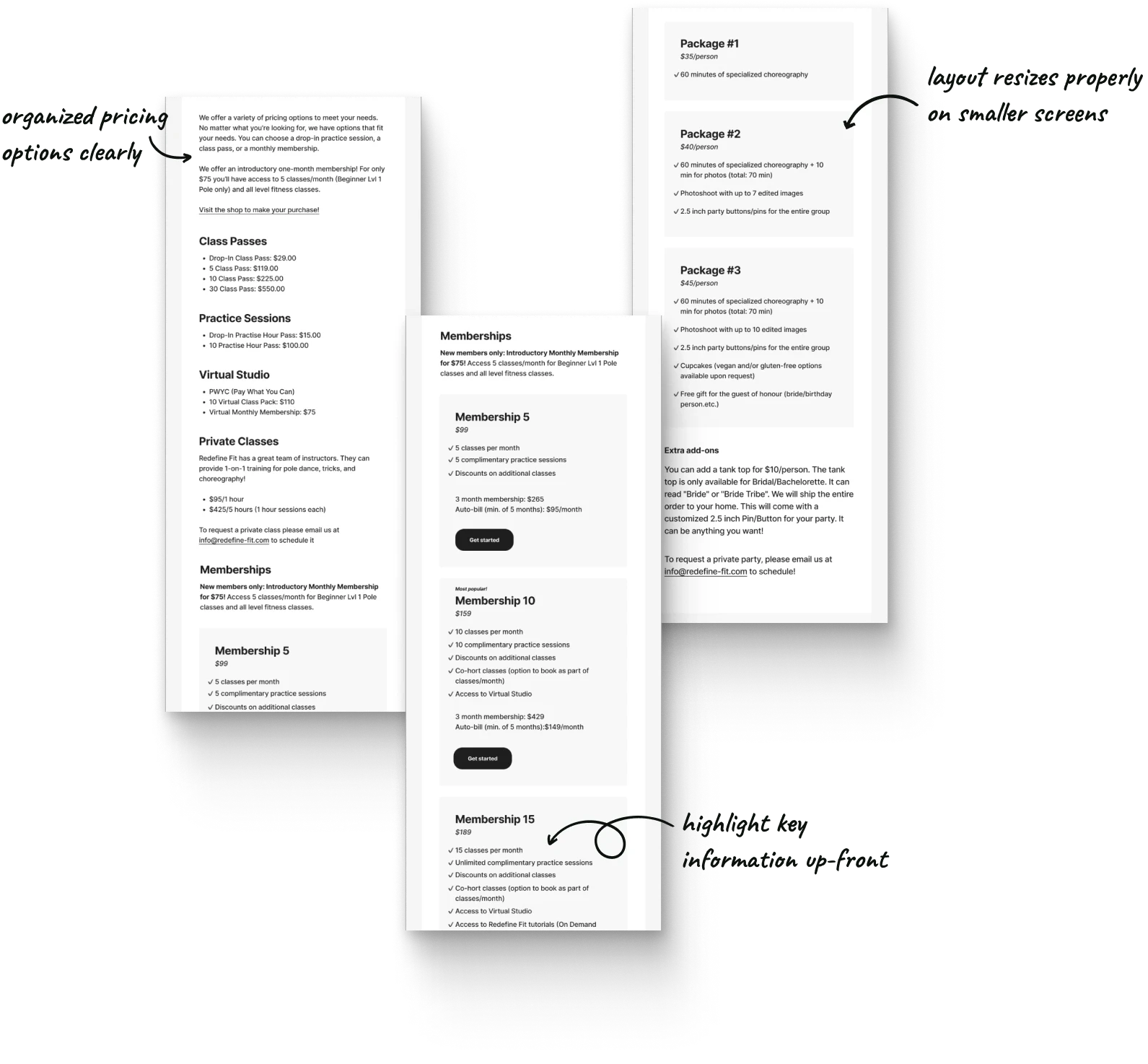


Pricing section improvements: Passes & Memberships, and Private Parties pages
Pricing section improvements: Passes & Memberships, and Private Parties pages
01
01
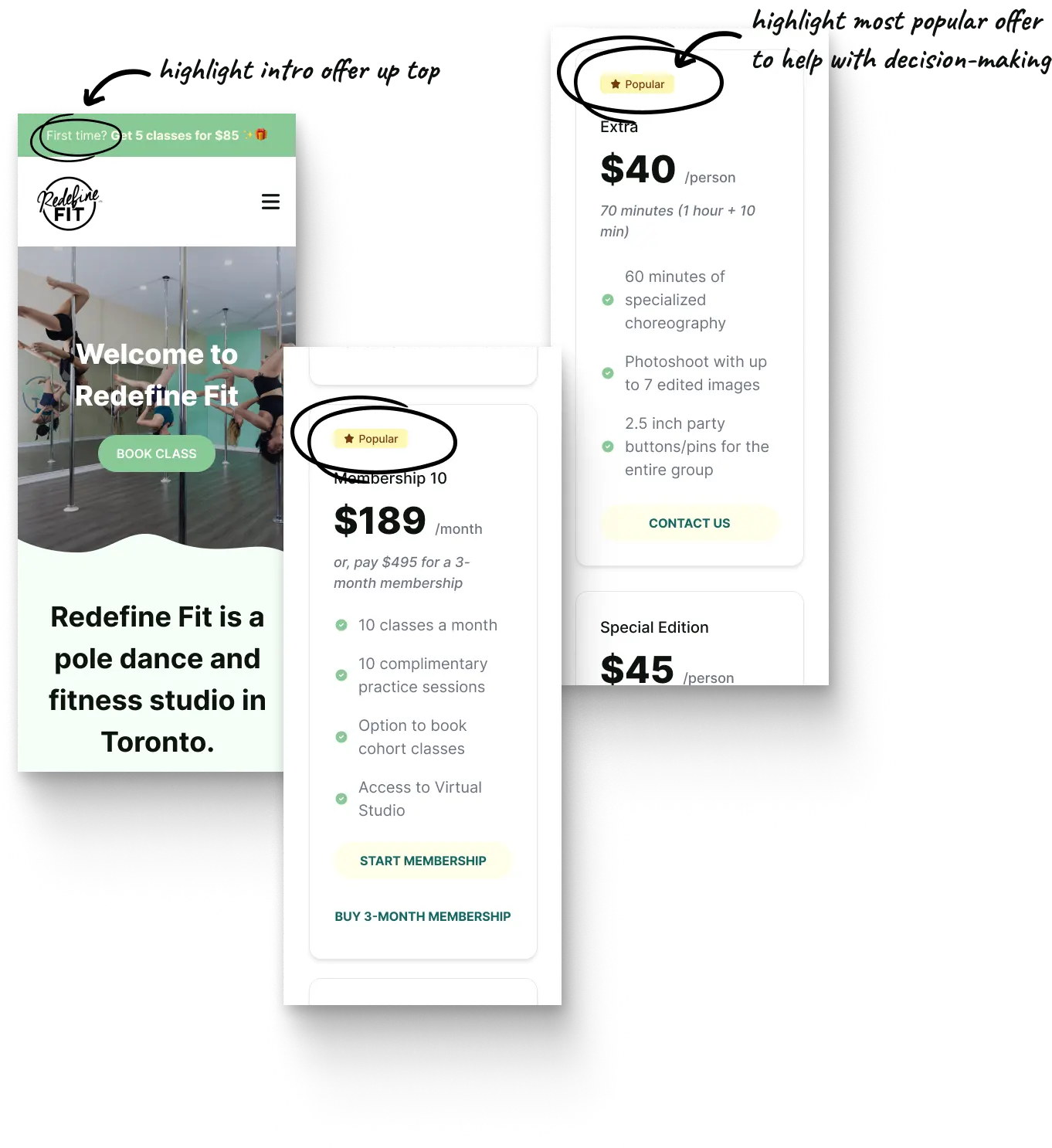
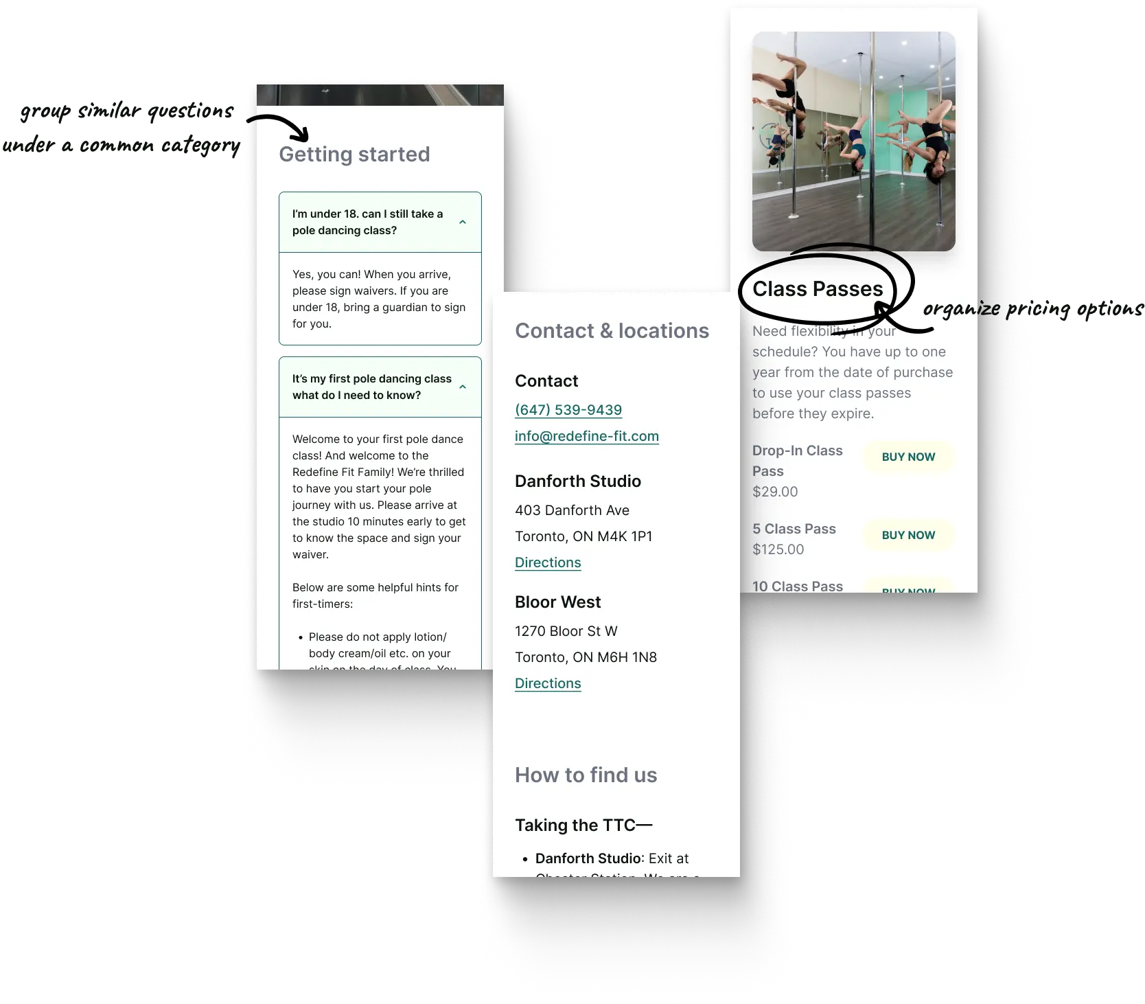
Organized pricing options clearly
Organized pricing options clearly
02
02
Highlighted key content up front
Highlighted key content up front
Blog section: Usability fixes and improvements
Blog section: Usability fixes and improvements
01
01
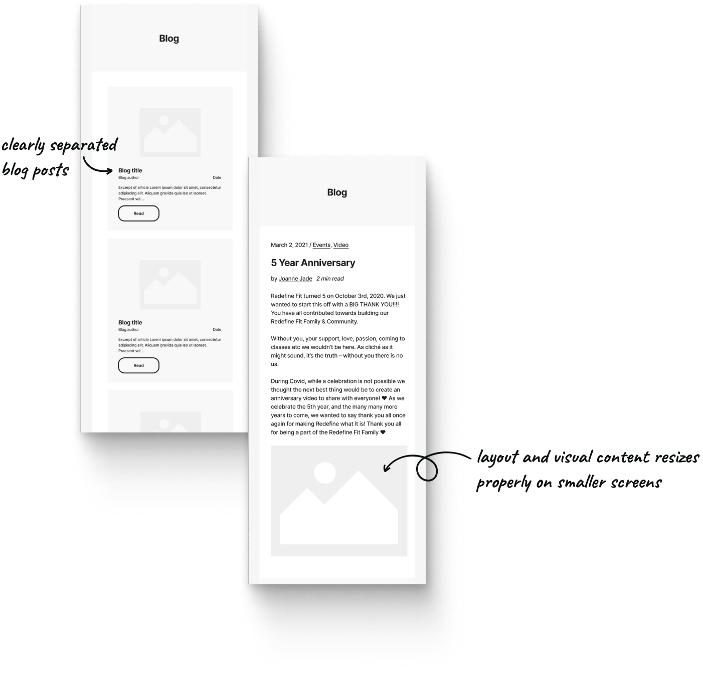
Adjusted blog layout for resizing content, images, and videos
Adjusted blog layout for resizing content, images, and videos
02
02
Clearly separated blog posts
Clearly separated blog posts


Final Chapter: Psychology of Design
Final Chapter: Psychology of Design
Final Chapter: Psychology of Design


Using behavioural science to improve the student browsing and decision-making experience
Using behavioural science to improve the student browsing and decision-making experience
Using behavioural science to improve the student browsing and decision-making experience
Psychology of UX | Decision Making
Psychology of UX | Decision Making
Satisficing
Satisficing
What is it? People often choose the first option that meets their basic needs. Getting all the necessary information for the best decision can be hard or time-consuming.
What is it? People often choose the first option that meets their basic needs. Getting all the necessary information for the best decision can be hard or time-consuming.
How is it applied? To help new clients decide quickly, I highlighted the most valuable and popular offers.
How is it applied? To help new clients decide quickly, I highlighted the most valuable and popular offers.




Psychology of UX | Decision Making
Psychology of UX | Decision Making
Chunking
Chunking
What is it? Present information in small, meaningful sections to help users remember it.
What is it? Present information in small, meaningful sections to help users remember it.
How is it applied? The website had too much information at once. Creating different pages and subsections makes it easier for students to find what they need.
How is it applied? The website had too much information at once. Creating different pages and subsections makes it easier for students to find what they need.
Psychology of UX | Decision Making
Psychology of UX | Decision Making
Jakob's Law
Jakob's Law
What is it? People spend most of their time on other sites and prefer familiar layouts.
What is it? People spend most of their time on other sites and prefer familiar layouts.
How is it applied? By modelling our navigation and page layout after other fitness sites, we can meet most people’s expectations and create an accessible experience.
How is it applied? By modelling our navigation and page layout after other fitness sites, we can meet most people’s expectations and create an accessible experience.




Psychology of UX | Persuasion & Influence
Psychology of UX | Persuasion & Influence
Social Proof
Social Proof
What is it? People look to others' opinions and behaviors to guide their own.
What is it? People look to others' opinions and behaviors to guide their own.
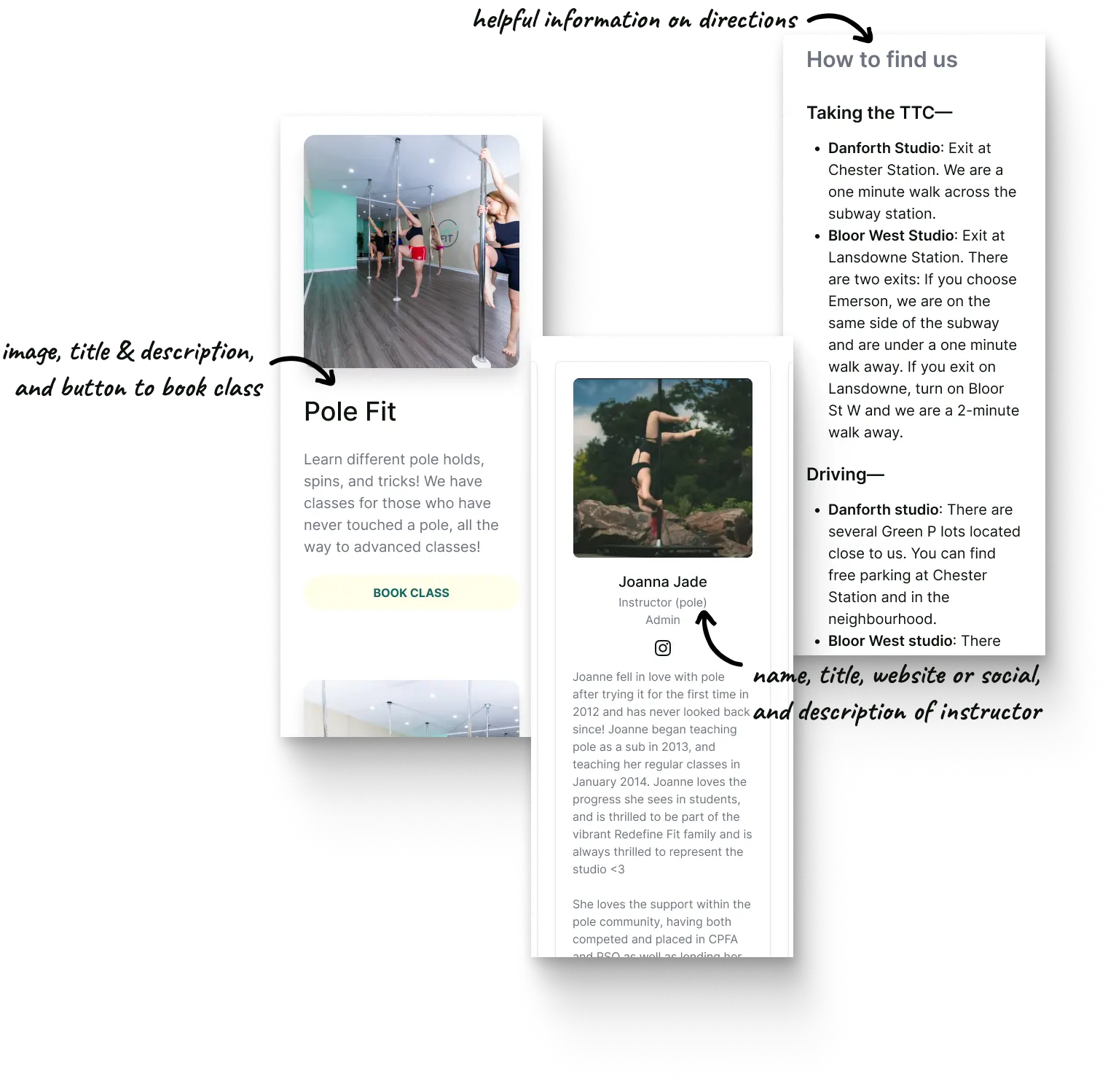
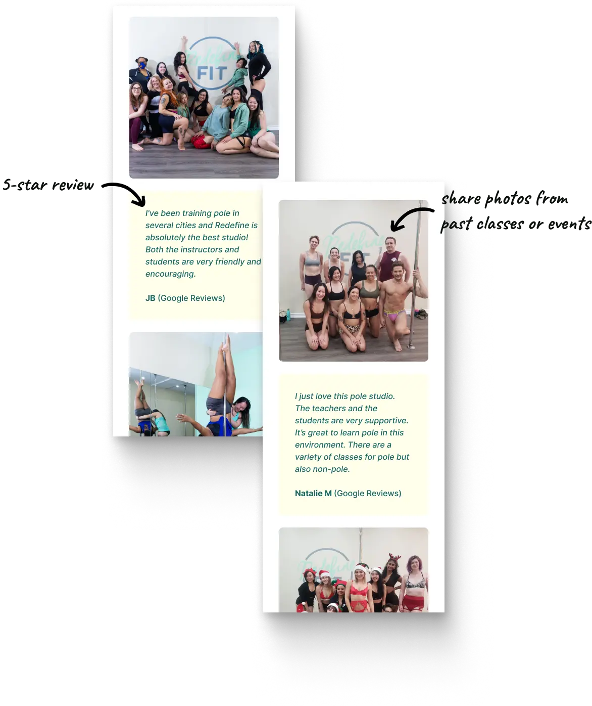
How is it applied? Showing pictures of students enjoying pole dance builds community. Sharing positive reviews makes people curious and gains their trust.
How is it applied? Showing pictures of students enjoying pole dance builds community. Sharing positive reviews makes people curious and gains their trust.
Psychology of UX | Emotion & Delight
Psychology of UX | Emotion & Delight
Aesthetic-Usability Effect
Aesthetic-Usability Effect
What is it? People see attractive design as more usable.
What is it? People see attractive design as more usable.
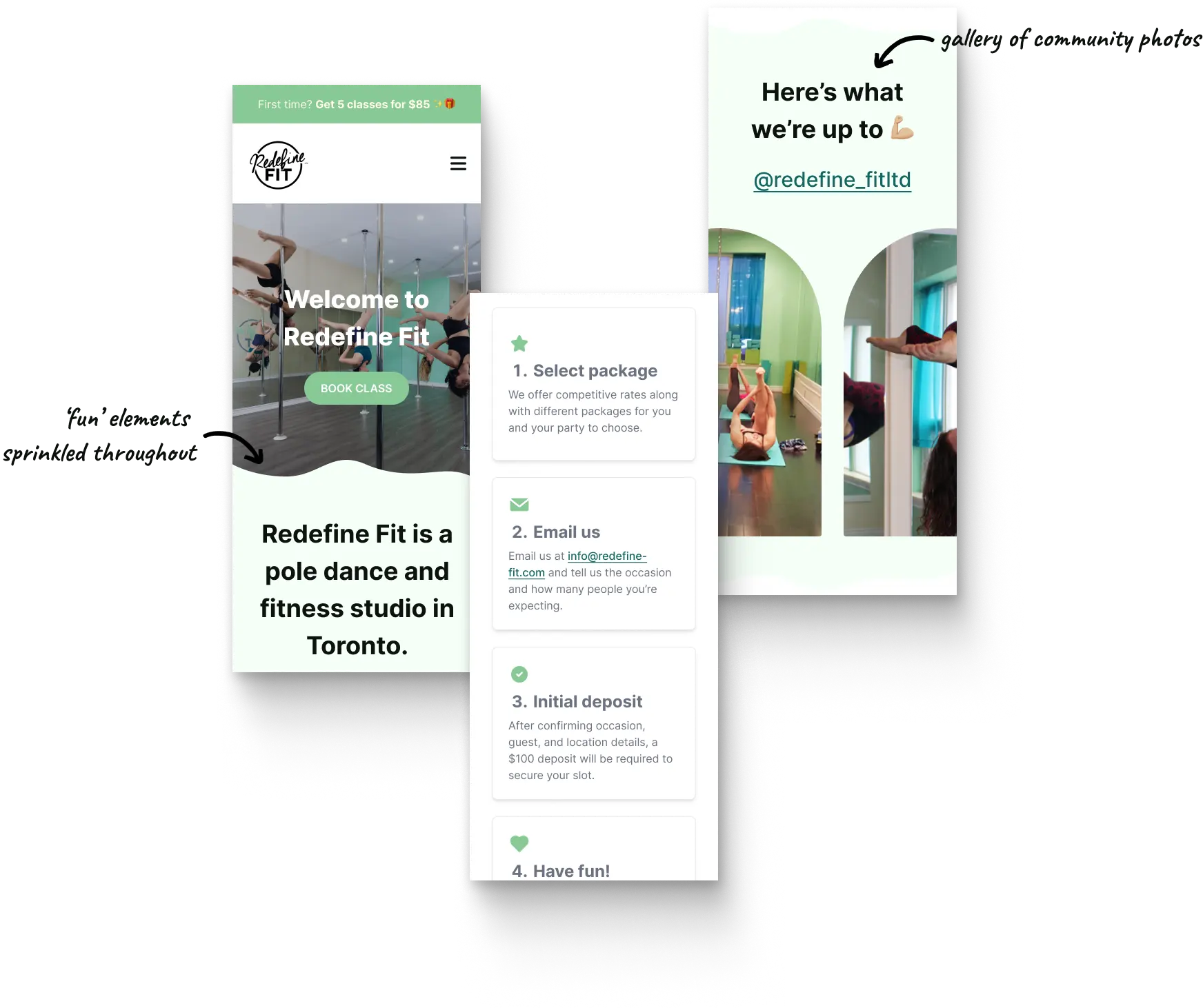
How is it applied? The improved look, especially on the home page, makes the website more enjoyable to explore!
How is it applied? The improved look, especially on the home page, makes the website more enjoyable to explore!


An Epilogue
An Epilogue
An Epilogue


Level-up: Lessons for future experiences
Level-up: Lessons for future experiences
Level-up: Lessons for future experiences


Seek inspiration from indirect sources
Finding inspiration outside your community can be very valuable. I discovered fresh ideas by exploring other fitness studio websites that weren't pole dance-related. This helped me refine a design direction that better aligned with Redefine Fit's brand and clientele.
Finding inspiration outside your community can be very valuable. I discovered fresh ideas by exploring other fitness studio websites that weren't pole dance-related. This helped me refine a design direction that better aligned with Redefine Fit's brand and clientele.

Stay creative within constraints
Since pole fitness is one of my hobbies, I began with a big vision for the website design. But with limited resources and time, I focused on the key areas: improving navigation and registration, while still being creative within those constraints.
Since pole fitness is one of my hobbies, I began with a big vision for the website design. But with limited resources and time, I focused on the key areas: improving navigation and registration, while still being creative within those constraints.


Read another case story?
Read another case story?
Read another case story?


