
Community Navigator Redesign: Design System
Community Navigator Redesign: Design System
Community Navigator Redesign: Design System
Design System • Collaboration
Design System • Collaboration
How I developed a white-label design system for a services directory app, streamlining app design and development for clients and reducing design inconsistencies by 30%.
How I developed a white-label design system for a services directory app, streamlining app design and development for clients and reducing design inconsistencies by 30%.

Role
Role
Role
Product Designer
Product Designer
Product Designer
Client
Client
Client
IDENTOS Inc.
IDENTOS Inc.
IDENTOS Inc.
Duration
Duration
Duration
6 months
6 months
6 months
What was the main challenge?
What was the main challenge?
As more clients requested their own Community Navigator app, we realized the design was outdated and didn't showcase their content well. Without a proper redesign, we risked losing current customers and struggling to attract new ones.
As more clients requested their own Community Navigator app, we realized the design was outdated and didn't showcase their content well. Without a proper redesign, we risked losing current customers and struggling to attract new ones.
How was it resolved?
How was it resolved?
I created a flexible design system with reusable components, enabling designers and developers to update or build Navigators easily and consistently.
I created a flexible design system with reusable components, enabling designers and developers to update or build Navigators easily and consistently.
30%
30%
30%
reduction in design inconsistencies between designers
reduction in design inconsistencies between designers
85%
85%
85%
increase in configuration options, enhancing design exploration from 3 to 20+ unique layouts
increase in configuration options, enhancing design exploration from 3 to 20+ unique layouts
4 hrs
4 hrs
4 hrs
saved per week on resolving misunderstandings between design and development
saved per week on resolving misunderstandings between design and development

Project Storyline (a.k.a. a table of contents)
Project Storyline (a.k.a. a table of contents)

Chapter 01: Audit of the Community Navigator
Chapter 01: Audit of the Community Navigator
Chapter 01: Audit of the Community Navigator


Understanding the history and purpose of the Community Navigator
Understanding the history and purpose of the Community Navigator
Understanding the history and purpose of the Community Navigator
The Community Navigator is a mobile app that helps people connect with local resources and services in one place
The Community Navigator is a mobile app that helps people connect with local resources and services in one place
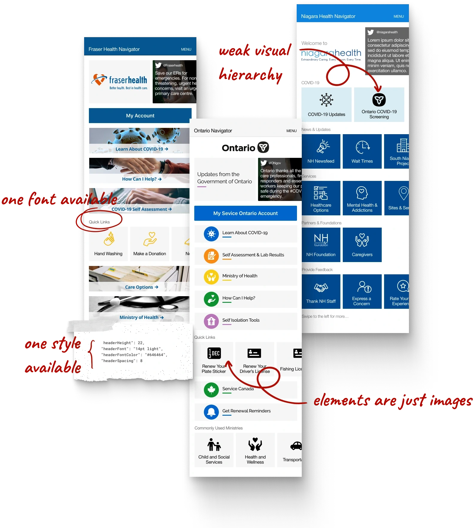
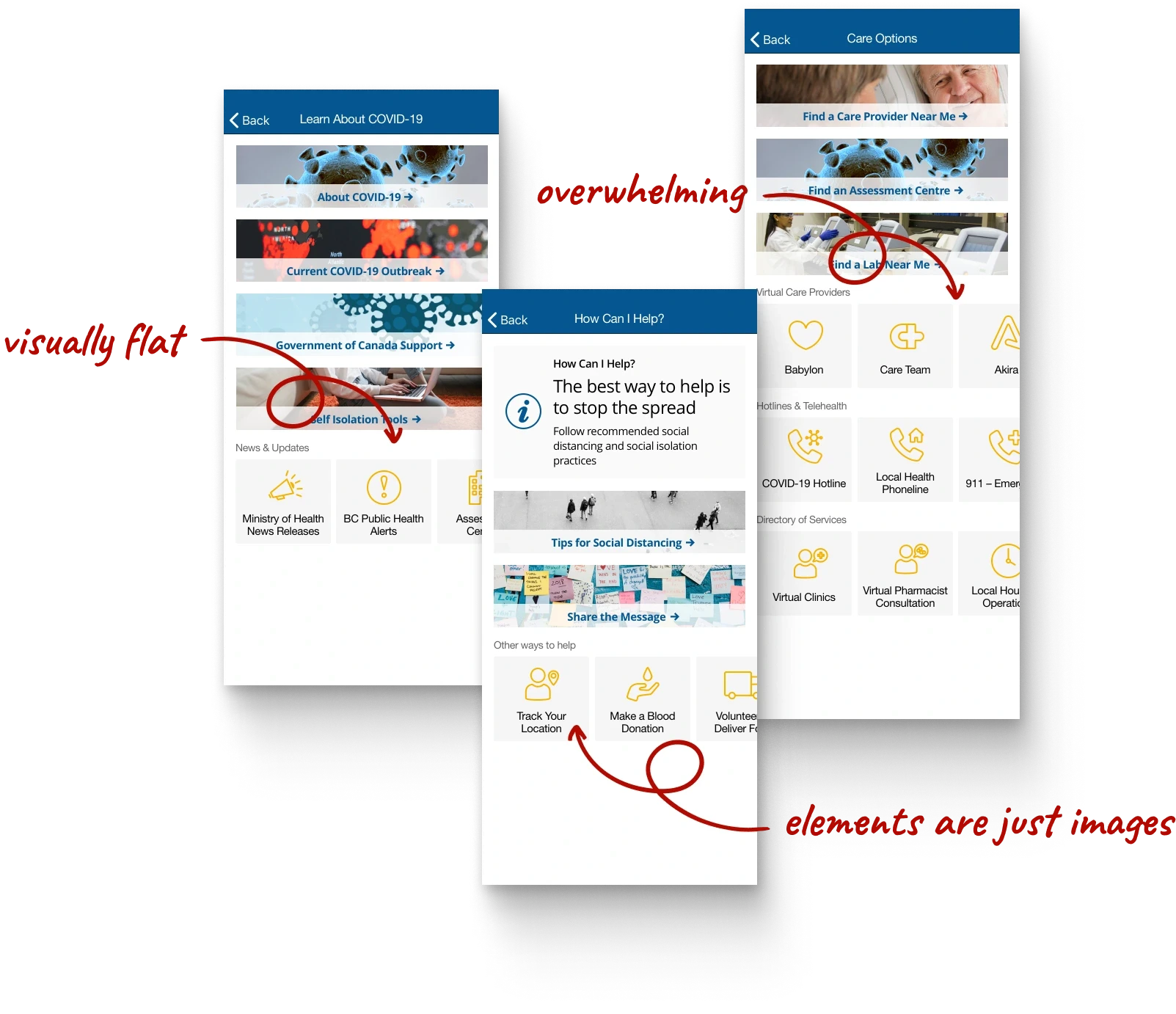
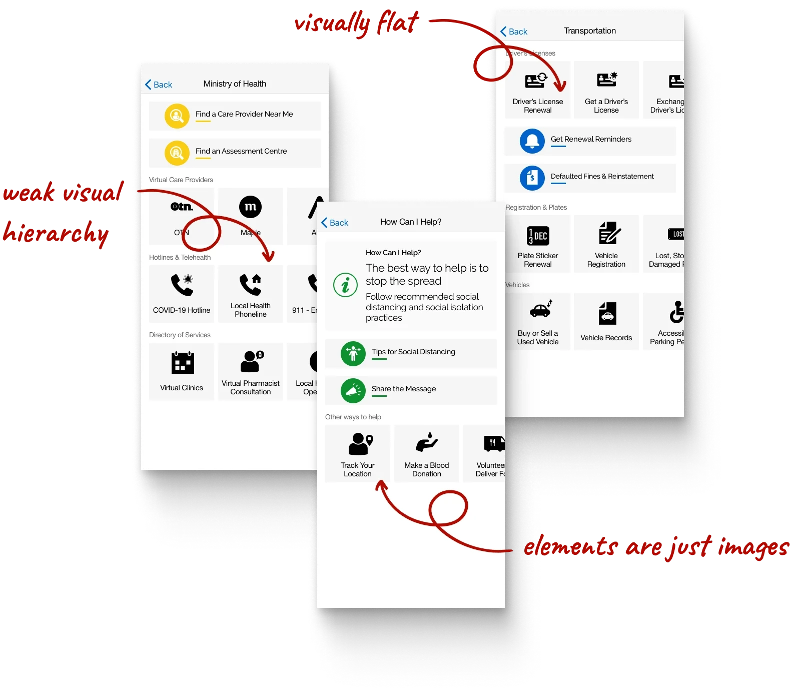
Design audit reviews revealed poor information hierarchy, limited visual design options, and accessibility issues
Design audit reviews revealed poor information hierarchy, limited visual design options, and accessibility issues


01
01
Visual hierarchy is weak because everything looks equally important
Visual hierarchy is weak because everything looks equally important
02
02
All text uses the same font, making it hard to distinguish between different types
All text uses the same font, making it hard to distinguish between different types
03
03
Interactive elements aren't functional, causing major accessibility issues
Interactive elements aren't functional, causing major accessibility issues
04
04
Exporting is inefficient since each item needs to be exported at different resolutions
Exporting is inefficient since each item needs to be exported at different resolutions




Desiring consistency and flexibility to create and update Navigators
Desiring consistency and flexibility to create and update Navigators
Needing to serve multiple industries beyond healthcare and government
Needing to serve multiple industries beyond healthcare and government


Chapter 02: Guidelines for the Community Navigator Design System
Chapter 02: Guidelines for the Community Navigator Design System
Chapter 02: Guidelines for the Community Navigator Design System


Refining the goals and needs for the Community Navigator design system
Refining the goals and needs for the Community Navigator design system
Refining the goals and needs for the Community Navigator design system


Setting expectations with the team: We can’t accommodate every use case right from the start. Since the Community Navigator is one of IDENTOS' older products that hasn’t evolved much over the years, it isn’t realistic to aim for an overly ambitious version of the design system right away. Also, given that most of the users are over 50, the redesign should focus on functionality over creativity.
Setting expectations with the team: We can’t accommodate every use case right from the start. Since the Community Navigator is one of IDENTOS' older products that hasn’t evolved much over the years, it isn’t realistic to aim for an overly ambitious version of the design system right away. Also, given that most of the users are over 50, the redesign should focus on functionality over creativity.


Product Designers
Product Designers
Use the design system of components to quickly update or create new Navigators for demos with internal and external teams.
Use the design system of components to quickly update or create new Navigators for demos with internal and external teams.

Product Owners
Product Owners
Reference the design system to confidently show clients what is possible.
Reference the design system to confidently show clients what is possible.

iOS & Android Developers
iOS & Android Developers
Define a system of reusable components with adjustable properties for easy customization and deployment.
Define a system of reusable components with adjustable properties for easy customization and deployment.
Guidelines of the Community Navigator white-label design system
Guidelines of the Community Navigator white-label design system
Together with the Lead Designer, we outlined guidelines for the design system based on my audit of the Community Navigator. The goal wasn't perfection but to create a starting point for reference.
Together with the Lead Designer, we outlined guidelines for the design system based on my audit of the Community Navigator. The goal wasn't perfection but to create a starting point for reference.
01
01
There should be a component for each type of content
There should be a component for each type of content
The system should cover most use cases, ensuring any content a client wants to add to their Navigator is well-represented.
The system should cover most use cases, ensuring any content a client wants to add to their Navigator is well-represented.
02
02
Components should be easy to customize, with clear configurations
Components should be easy to customize, with clear configurations
The system explains how to use each component and what can or can't be changed from the default settings.
The system explains how to use each component and what can or can't be changed from the default settings.
03
03
Each component must work well with others
Each component must work well with others
Each component can easily combine with others to create unique layouts.
Each component can easily combine with others to create unique layouts.
Types of content the Community Navigator supports
Types of content the Community Navigator supports
Currently, most content in our clients' Navigators links to informational web pages, web apps, or third-party apps.
Currently, most content in our clients' Navigators links to informational web pages, web apps, or third-party apps.
01
01
Links to client website pages
Links to client website pages
02
02
Links to client web or mobile apps
Links to client web or mobile apps
03
03
Third-party web or mobile apps
Third-party web or mobile apps
04
04
News updates and alerts
News updates and alerts
05
05
Social media posts
Social media posts

Chapter 03: Idea Exploration
Chapter 03: Idea Exploration
Chapter 03: Idea Exploration


Exploring ways to display different types of content in an app
Exploring ways to display different types of content in an app
Exploring ways to display different types of content in an app
Questions to consider when reviewing content-heavy websites and apps
Questions to consider when reviewing content-heavy websites and apps
To start, I examined various content-rich websites and mobile apps to understand how they organize and curate content. I also revisited Atomic Design by Brad Frost to refresh my understanding of modular design.
To start, I examined various content-rich websites and mobile apps to understand how they organize and curate content. I also revisited Atomic Design by Brad Frost to refresh my understanding of modular design.
01
01
How do they display different types of content?
How do they display different types of content?
02
02
How do they prioritize and organize information?
How do they prioritize and organize information?
03
03
How do they highlight key content or actions?
How do they highlight key content or actions?
04
04
How do they represent less important content?
How do they represent less important content?

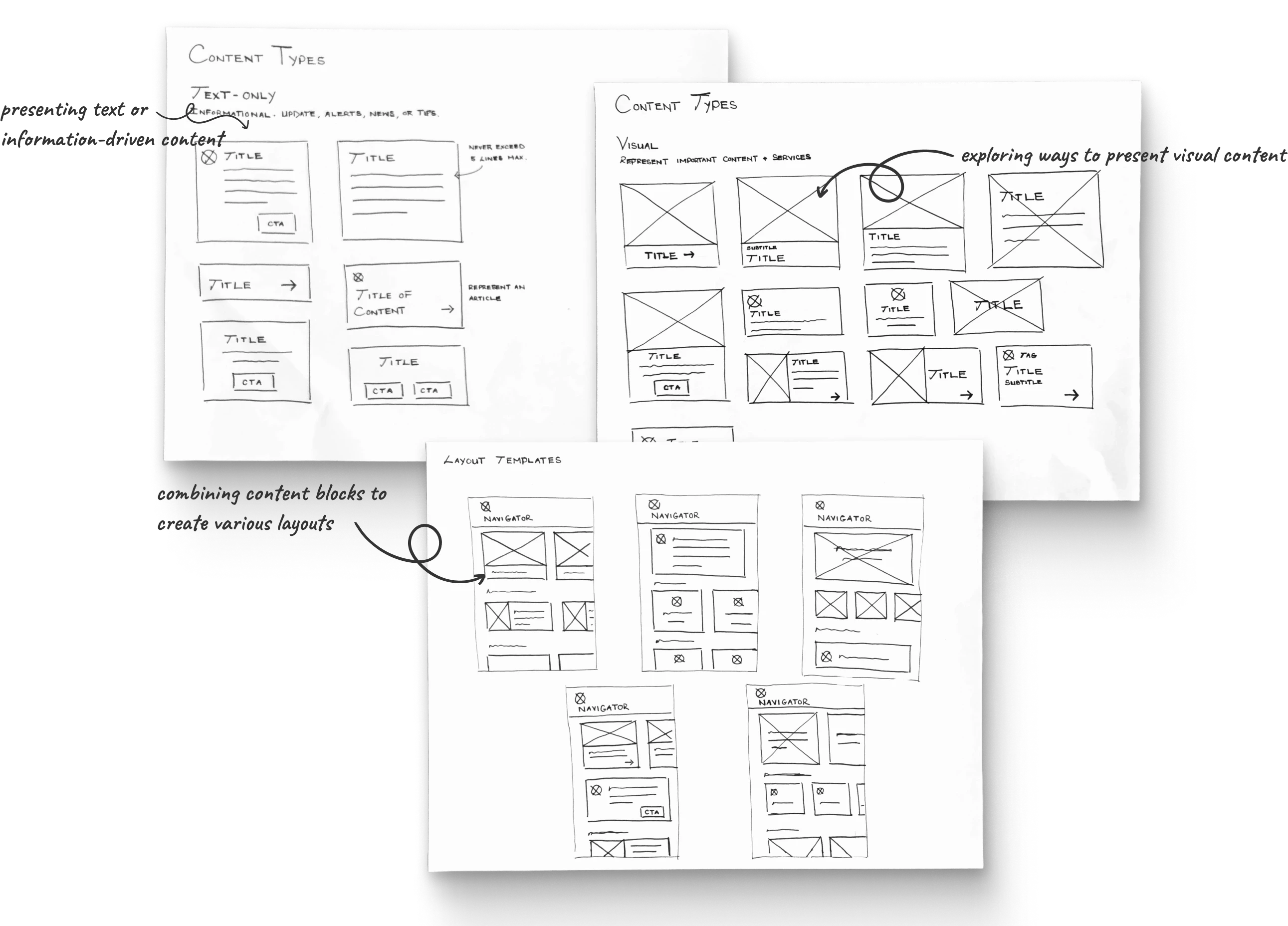


Content type #1: Large and visual-focused
Content type #1: Large and visual-focused
Primary content on the Navigator should be large and eye-catching to grab users' attention. Big images are perfect for highlighting key information, services, or main user actions.
Primary content on the Navigator should be large and eye-catching to grab users' attention. Big images are perfect for highlighting key information, services, or main user actions.
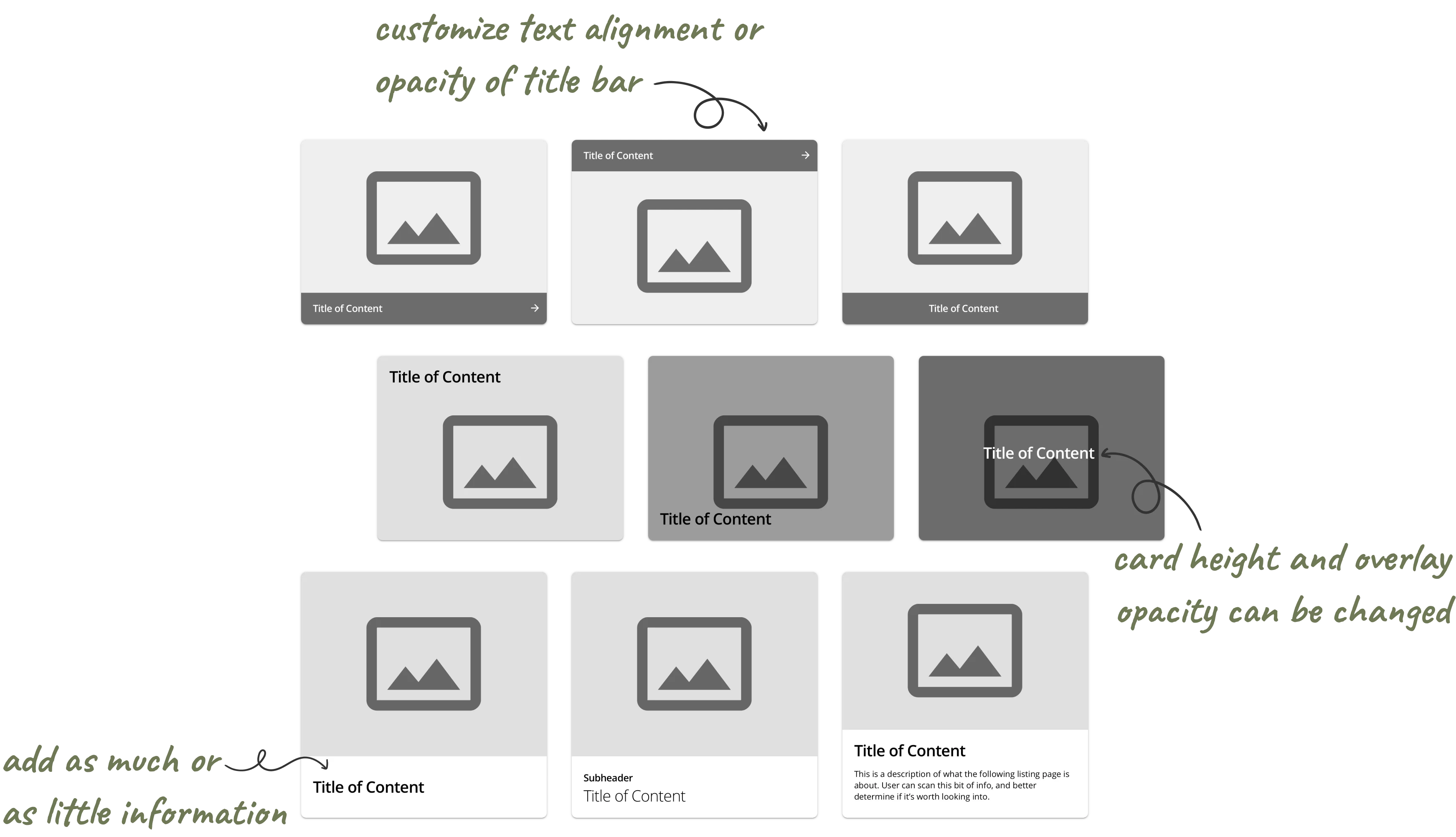


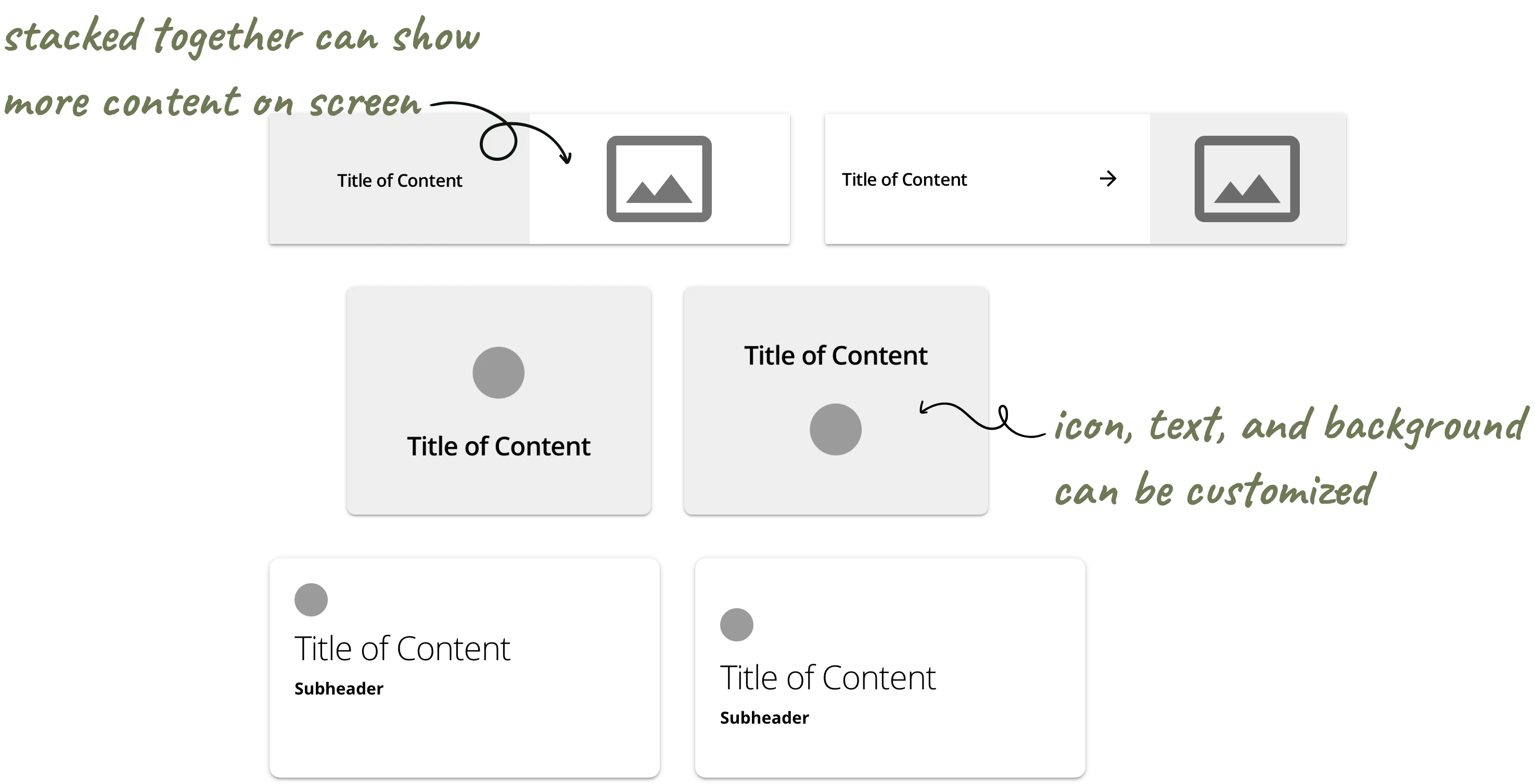


Content type #2: Large-medium with smaller visuals
Content type #2: Large-medium with smaller visuals
Secondary content is important but doesn't need to be as prominent. Here, small images, like icons or illustrations, are ideal for displaying other information, services, or less critical user actions.
Secondary content is important but doesn't need to be as prominent. Here, small images, like icons or illustrations, are ideal for displaying other information, services, or less critical user actions.
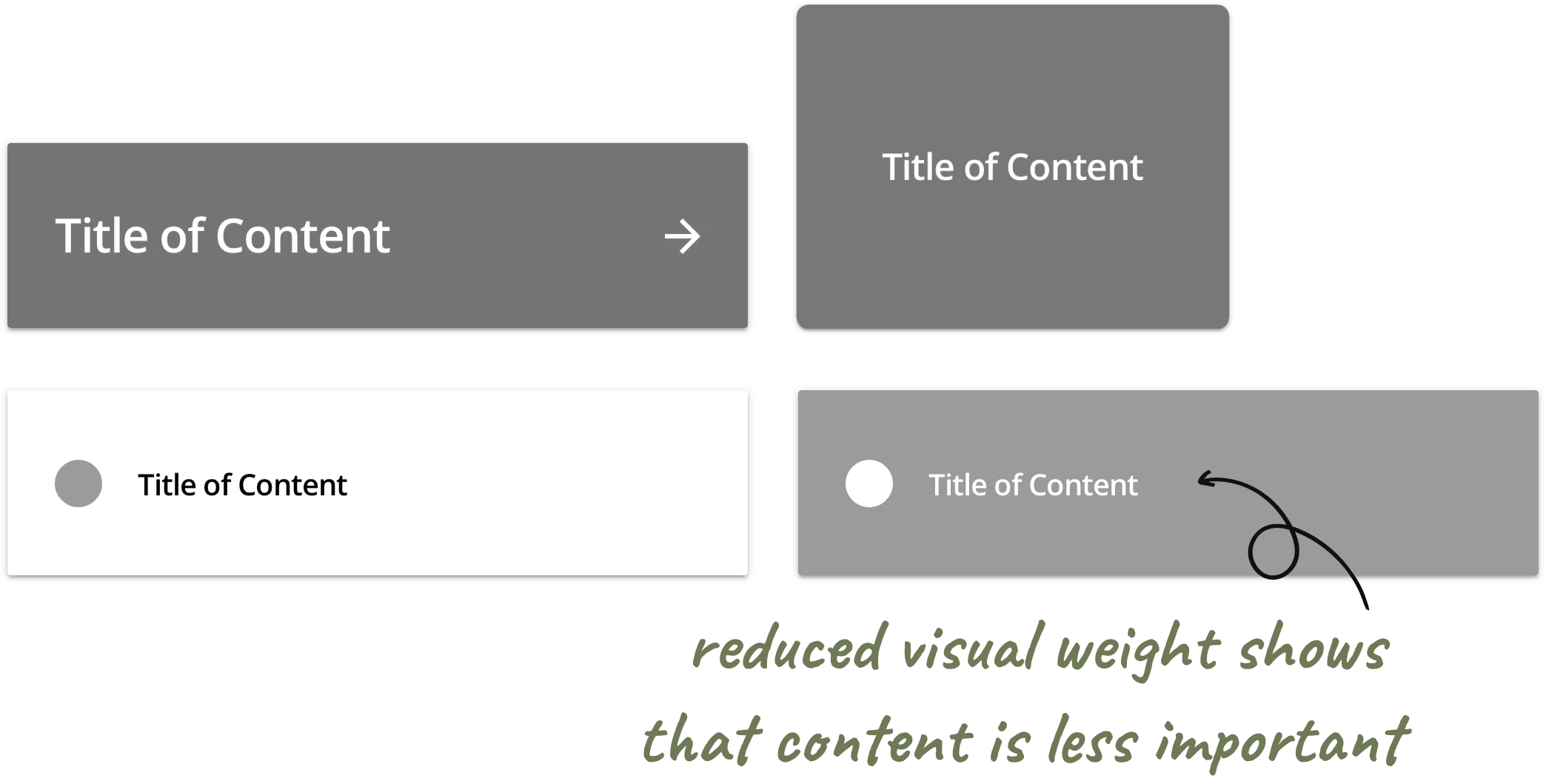
Content type #3: Small and text-based
Content type #3: Small and text-based
Tertiary content is the least important on the Navigator. It typically includes text only, with a small icon if needed.
Tertiary content is the least important on the Navigator. It typically includes text only, with a small icon if needed.


Chapter 04: Collecting Team Feedback
Chapter 04: Collecting Team Feedback
Chapter 04: Collecting Team Feedback


Reviewing the initial brainstorm with the product team
The team needed more clarity on the main components and what could or couldn’t be customized
The team needed more clarity on the main components and what could or couldn’t be customized
At this point, I started the design system in Figma: Other designers can easily access it to mock-up new Navigators, while developers can review the components.
At this point, I started the design system in Figma: Other designers can easily access it to mock-up new Navigators, while developers can review the components.
01
01
What can and can't be easily customized out of the box?
What can and can't be easily customized out of the box?
02
02
What is the simplest, default version of each component?
What is the simplest, default version of each component?
The Design Lead and I agreed that I should focus on the key component types and their essential features
The Design Lead and I agreed that I should focus on the key component types and their essential features
I organized my initial brainstorm into three categories based on content importance. Importance is defined by resources, services, or actions that clients’ customers access most often or that clients want customers to notice.
I organized my initial brainstorm into three categories based on content importance. Importance is defined by resources, services, or actions that clients’ customers access most often or that clients want customers to notice.
01
01
What are the differences between the components?
What are the differences between the components?
02
02
How should each component be used?
How should each component be used?
03
03
How should we reference these components in discussions?
How should we reference these components in discussions?
04
04
How will these components work with accessibility features turned on?
How will these components work with accessibility features turned on?

Chapter 05: Configuring Community Navigator Components
Chapter 05: Configuring Community Navigator Components
Chapter 05: Configuring Community Navigator Components


Defining the properties and use cases for each component in the design system
Defining the properties and use cases for each component in the design system
Defining the properties and use cases for each component in the design system

Design Psychology principles to guide the redesign
Design Psychology principles to guide the redesign
01
01
Aesthetic-Usability Effect
Aesthetic-Usability Effect
People view attractive design as more usable. By presenting content in different ways based on importance, we can showcase the client’s brand in a clean and consistent manner.
People view attractive design as more usable. By presenting content in different ways based on importance, we can showcase the client’s brand in a clean and consistent manner.
02
02
Gestalt Principle of Proximity
Gestalt Principle of Proximity
Objects that are close to each other tend to be grouped together. I organized the content based on two factors: 1) the importance of the information and 2) the type of information (e.g., visual or text).
Objects that are close to each other tend to be grouped together. I organized the content based on two factors: 1) the importance of the information and 2) the type of information (e.g., visual or text).
03
03
Gestalt Principle of Similarity
Gestalt Principle of Similarity
Elements that look similar are seen as part of the same group. In the redesign, I ensured each content type had its own unique properties.
Elements that look similar are seen as part of the same group. In the redesign, I ensured each content type had its own unique properties.
04
04
Sense-making: Information Scent
Sense-making: Information Scent
People engage with elements that seem most relevant to their tasks or interests. Accurately representing each type of content helps them quickly identify what they need.
People engage with elements that seem most relevant to their tasks or interests. Accurately representing each type of content helps them quickly identify what they need.
Primary Content
Primary Content
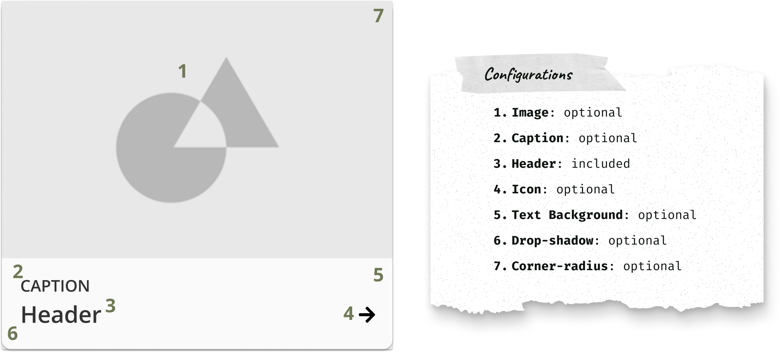
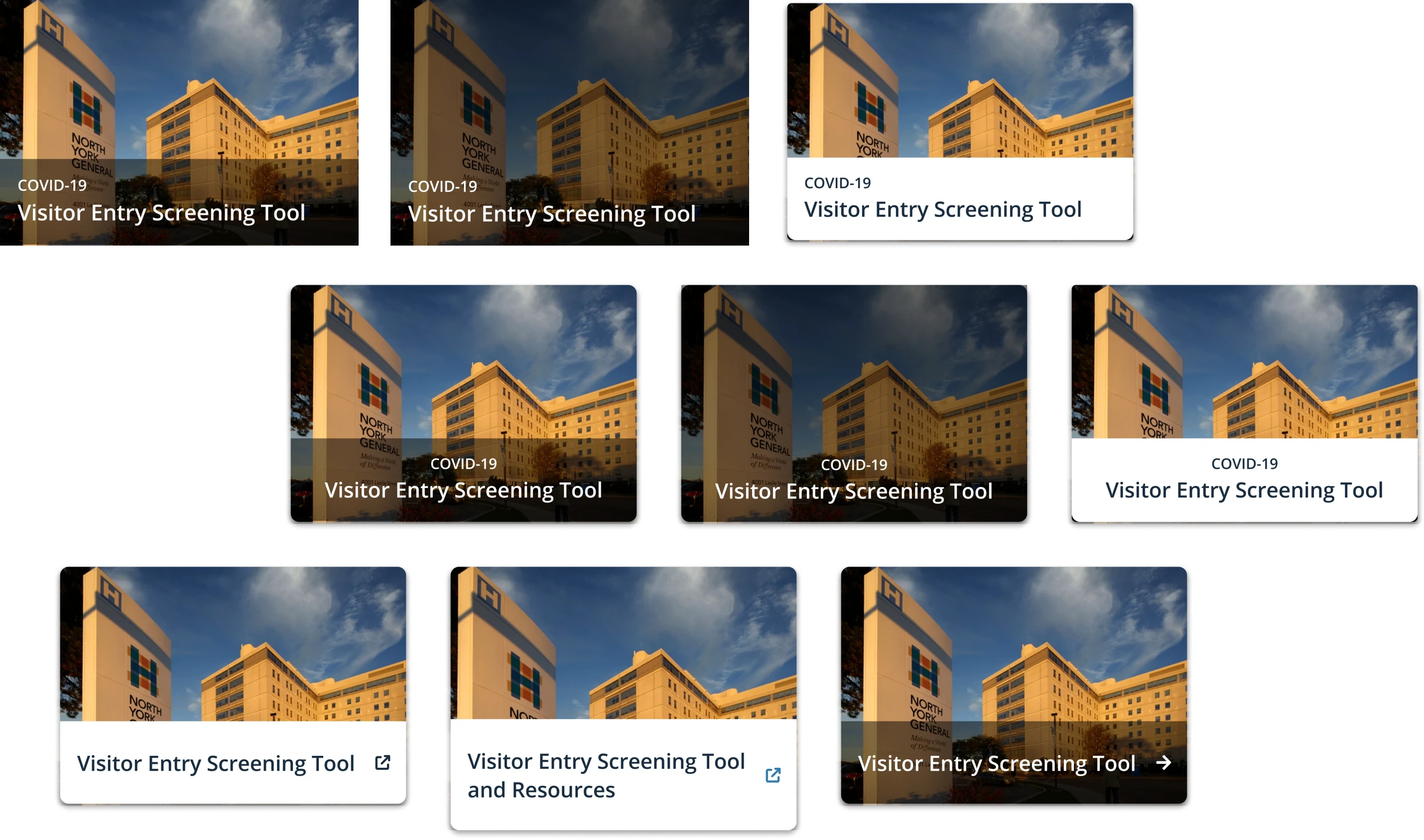
Featured content card: The key service, resource, or action
Featured content card: The key service, resource, or action
Purpose: To showcase the most important content on the page and utilize valuable space.
Represents the most important content or action on the page—this is the main customer and client need
Purpose: To showcase the most important content on the page and utilize valuable space.
Represents the most important content or action on the page—this is the main customer and client need





Secondary Content
Secondary Content
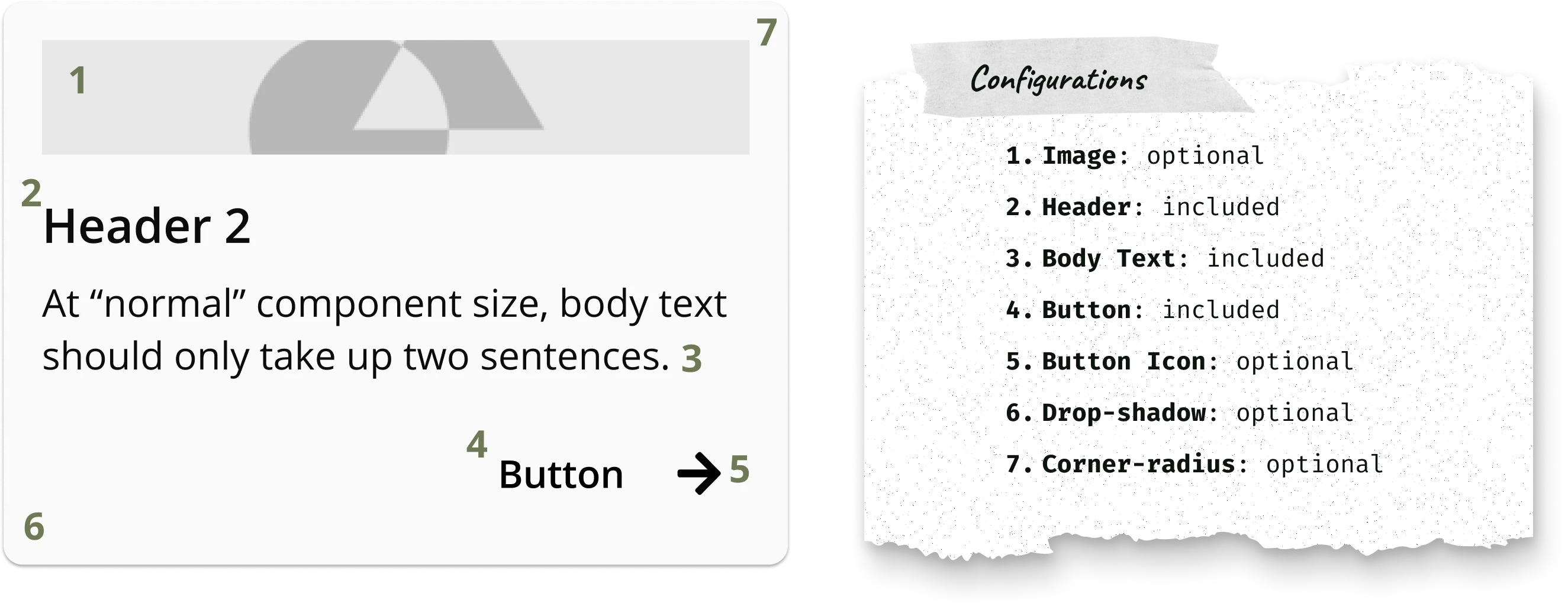
Frequently accessed content card: A service or resource most often used
Frequently accessed content card: A service or resource most often used
Purpose: To highlight a handful of services or resources the client knows their customers use or visit most often.
Represents content or actions customers need to access, but aren’t the client's top priority
Purpose: To highlight a handful of services or resources the client knows their customers use or visit most often.
Represents content or actions customers need to access, but aren’t the client's top priority





Tertiary Content
Tertiary Content
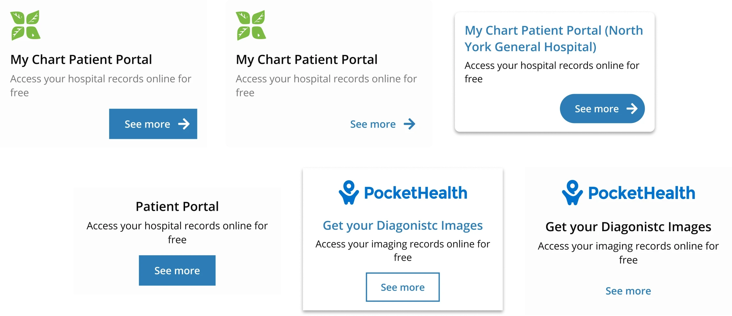
Feature content card: Other useful tools or resources
Feature content card: Other useful tools or resources
Purpose: To showcase internal or third-party tools or resources customers might find helpful. Represents content or actions customers don’t access often and isn’t the client's priority
Purpose: To showcase internal or third-party tools or resources customers might find helpful. Represents content or actions customers don’t access often and isn’t the client's priority



Tertiary Content
Tertiary Content
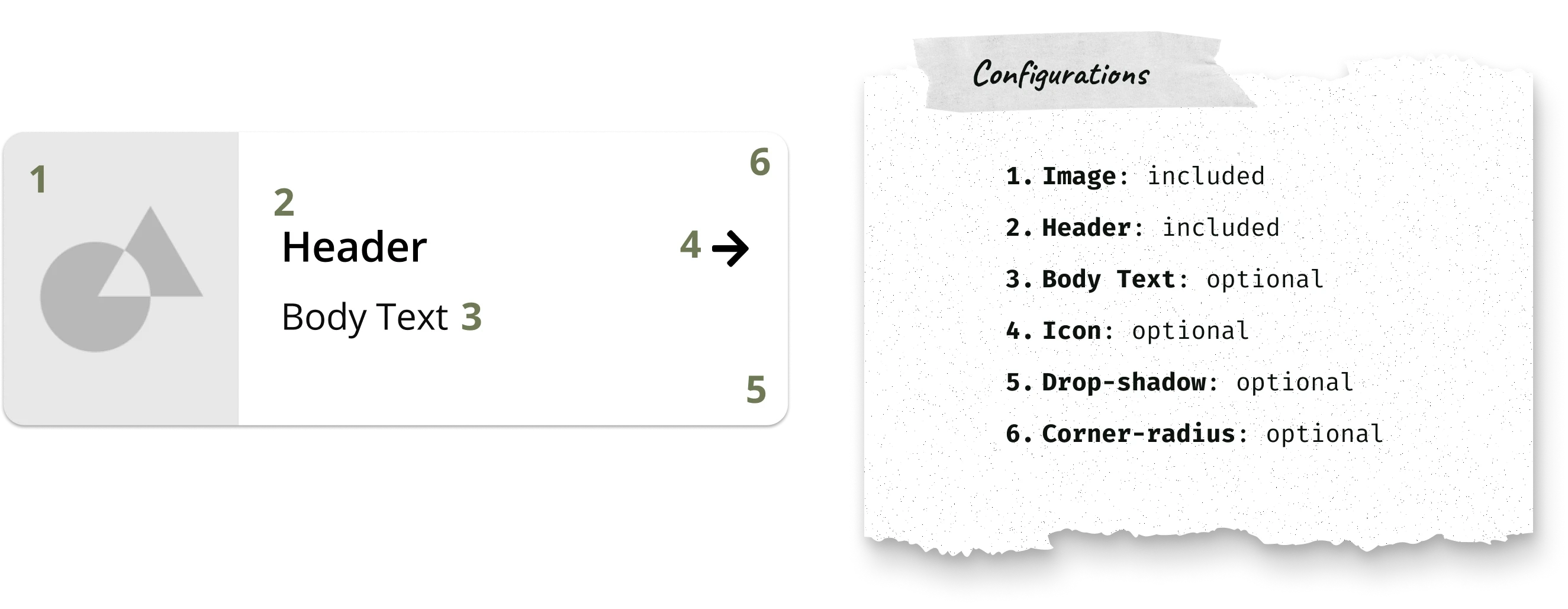
Small feature content card: A collection of tools
Small feature content card: A collection of tools
Purpose: To showcase a smaller collection of internal or third-party tools or information customers might find useful. Represents content or actions customers don’t access often and isn’t the client's priority
Purpose: To showcase a smaller collection of internal or third-party tools or information customers might find useful. Represents content or actions customers don’t access often and isn’t the client's priority

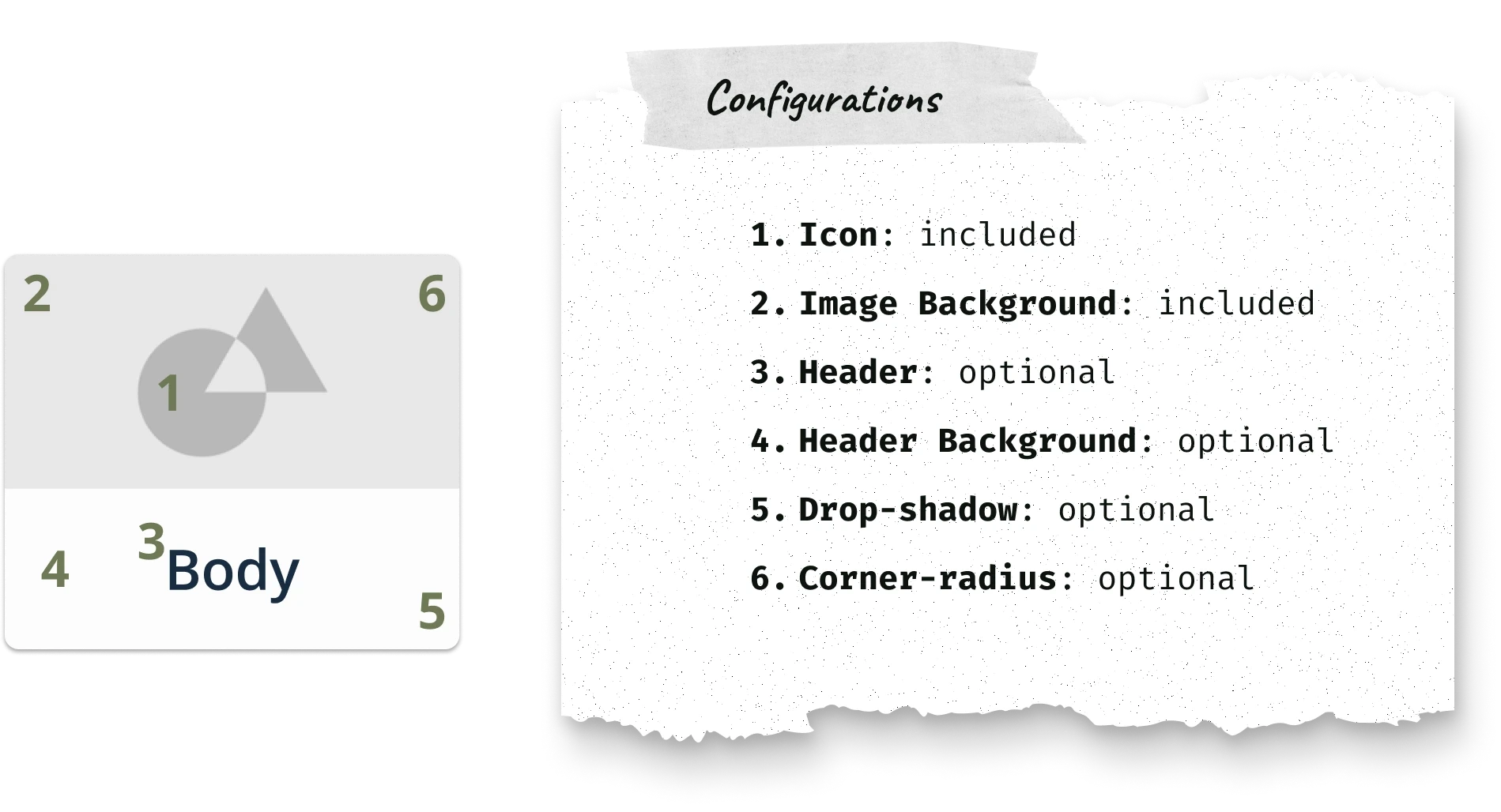


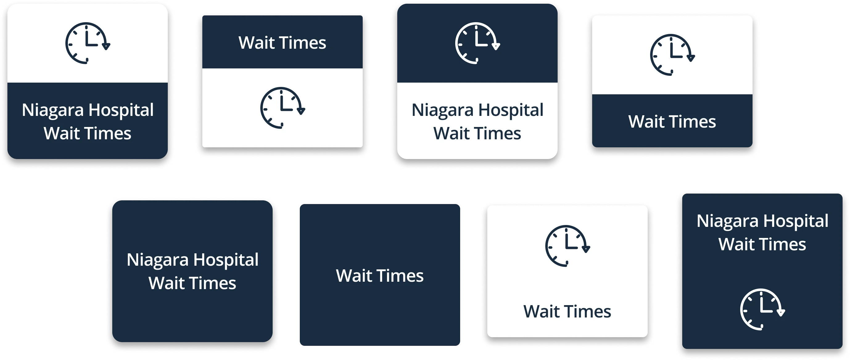


Tertiary Content
Tertiary Content
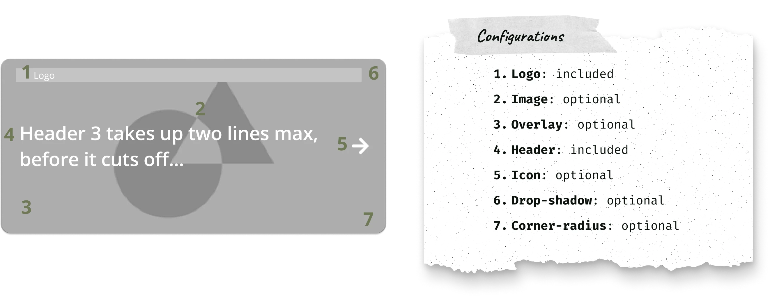
Service updates content card: Sharing important and timely information
Service updates content card: Sharing important and timely information
Purpose: To inform customers about important announcements, service updates, or necessary actions.
Purpose: To inform customers about important announcements, service updates, or necessary actions.

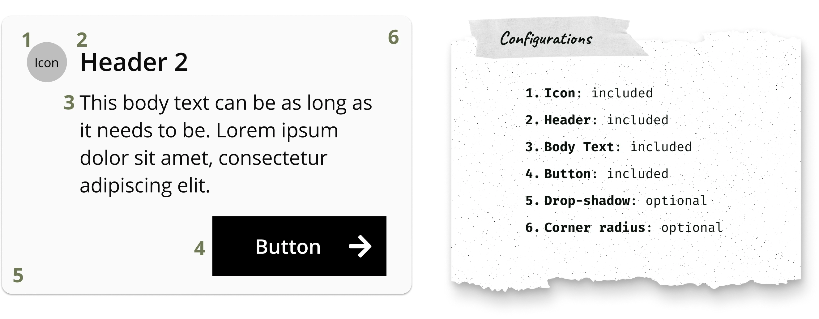


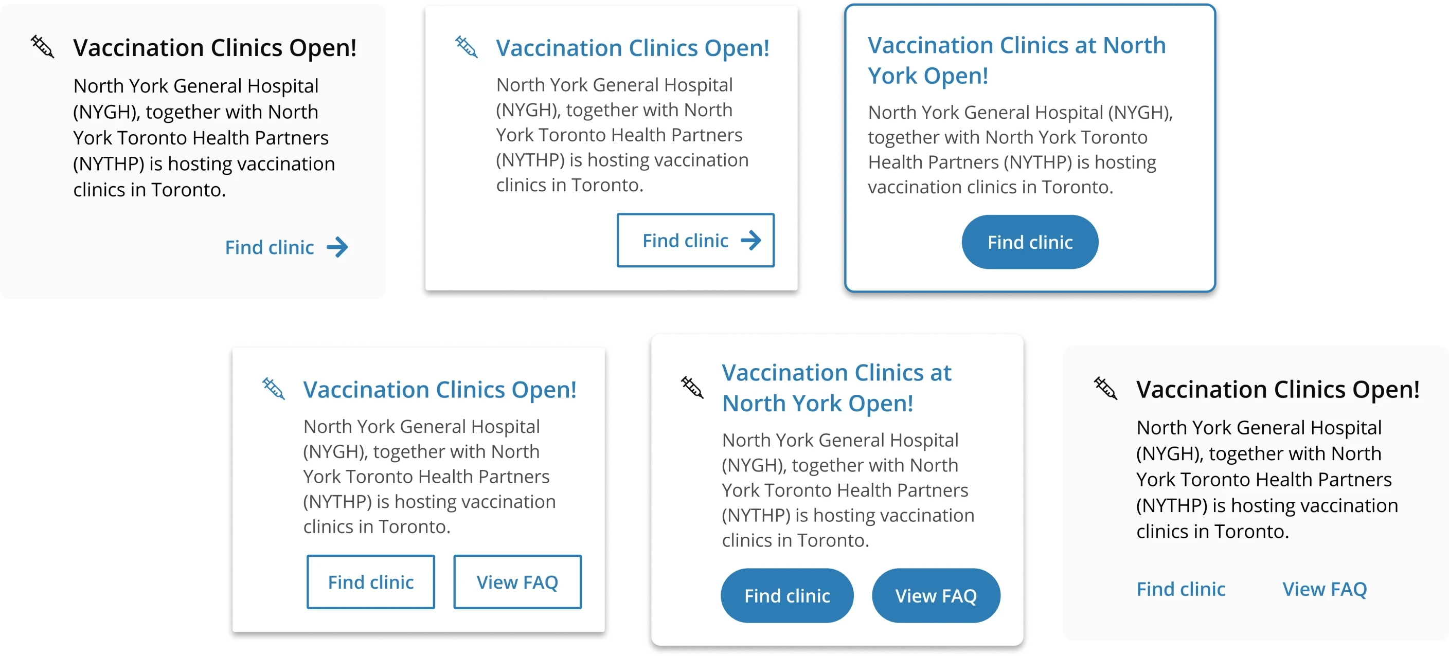


Tertiary Content
Tertiary Content
News article content card: Links to external blog posts or media pages
News article content card: Links to external blog posts or media pages
Purpose: To update customers on service changes or helpful information that doesn’t need immediate attention, especially if they lack an active social media presence.
Purpose: To update customers on service changes or helpful information that doesn’t need immediate attention, especially if they lack an active social media presence.



Tertiary Content
Tertiary Content
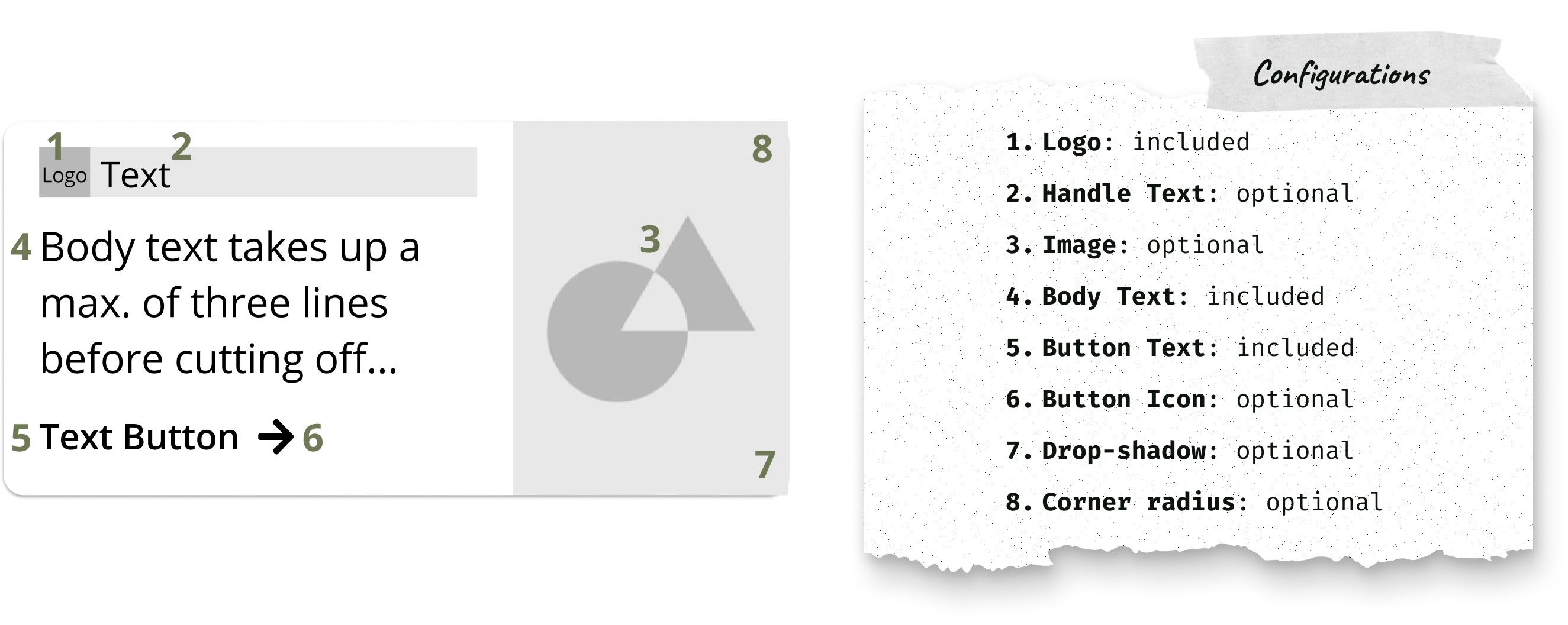
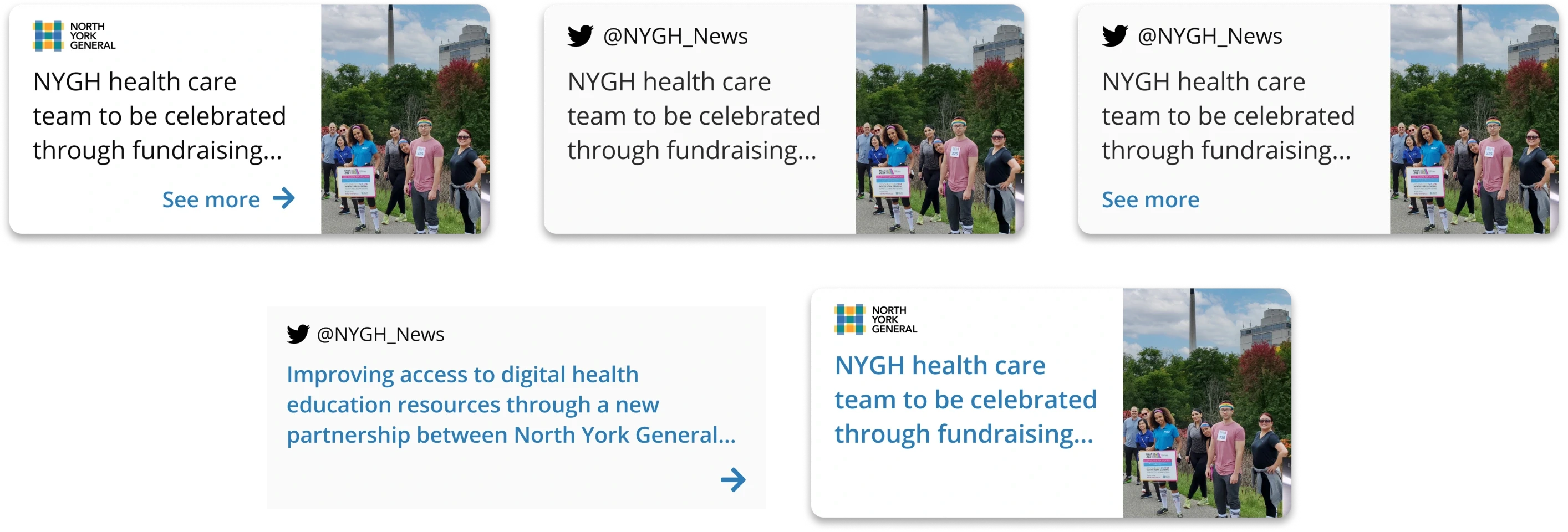
Social media content card: Links to posts from Twitter or Facebook
Social media content card: Links to posts from Twitter or Facebook
Purpose: To showcase a client's social media feed, especially if they don’t have a blog.
Purpose: To showcase a client's social media feed, especially if they don’t have a blog.





Mocking up hypothetical Navigators to test component versatility
Mocking up hypothetical Navigators to test component versatility
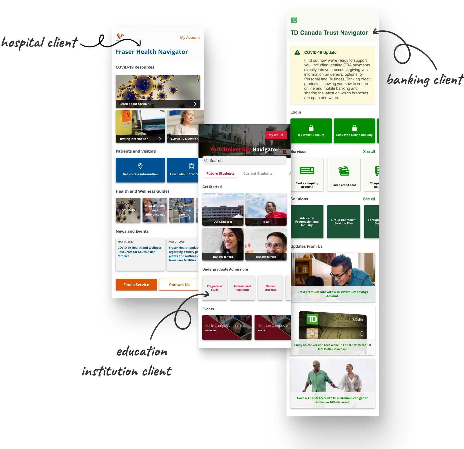
I redesigned one client’s Navigator and created two fictional ones for healthcare, finance, and education. The design possibilities were well-received in a company-wide presentation, including by the C-suite, marketing, and engineering teams.
I redesigned one client’s Navigator and created two fictional ones for healthcare, finance, and education. The design possibilities were well-received in a company-wide presentation, including by the C-suite, marketing, and engineering teams.


Final Chapter: Testing the Design System
Final Chapter: Testing the Design System
Final Chapter: Testing the Design System


Designing the latest Navigator using the new components
Designing the latest Navigator using the new components
Designing the latest Navigator using the new components
Putting it to the test: The new design system has made it much easier to design, present, and develop a Navigator
Putting it to the test: The new design system has made it much easier to design, present, and develop a Navigator
The new system was used to design a new Navigator that would involve a ton of resources across several participating hospitals. This project was ideal for assessing the components' versatility.
The new system was used to design a new Navigator that would involve a ton of resources across several participating hospitals. This project was ideal for assessing the components' versatility.
85%
85%
85%
increase in configuration options enhanced design exploration from 3 to 20+ unique layouts
increase in configuration options enhanced design exploration from 3 to 20+ unique layouts
The Design Lead and UX Design Intern used the design system to create a Navigator for a government client, incorporating links to informational web pages, internal resources, third-party tools, and services.
The Design Lead and UX Design Intern used the design system to create a Navigator for a government client, incorporating links to informational web pages, internal resources, third-party tools, and services.


30%
30%
30%
reduction in design inconsistencies between in-house designers
reduction in design inconsistencies between in-house designers
This was the first in-house design system, streamlining onboarding for new designers and enabling them to quickly create new layouts.
This was the first in-house design system, streamlining onboarding for new designers and enabling them to quickly create new layouts.
4 hrs
4 hrs
4 hrs
saved per week resolving misunderstandings between design and development
saved per week resolving misunderstandings between design and development
With the design system accessible to the entire product team, Navigator developers can rely on a single design reference, reducing clarification touchpoints and repetitive design questions.
With the design system accessible to the entire product team, Navigator developers can rely on a single design reference, reducing clarification touchpoints and repetitive design questions.


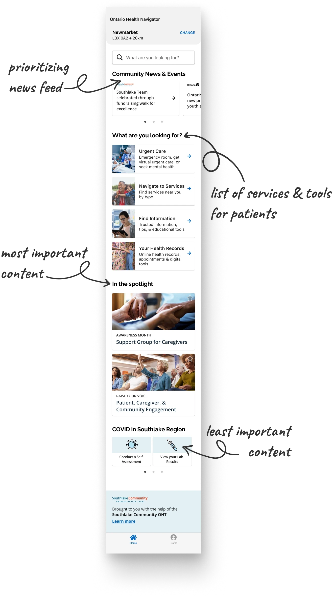
Home (landing screen): Improved organization and information hierarchy
Home (landing screen): Improved organization and information hierarchy
The Design Lead and UX Design Intern easily used the components to represent different types of information with varying levels of importance.
The Design Lead and UX Design Intern easily used the components to represent different types of information with varying levels of importance.


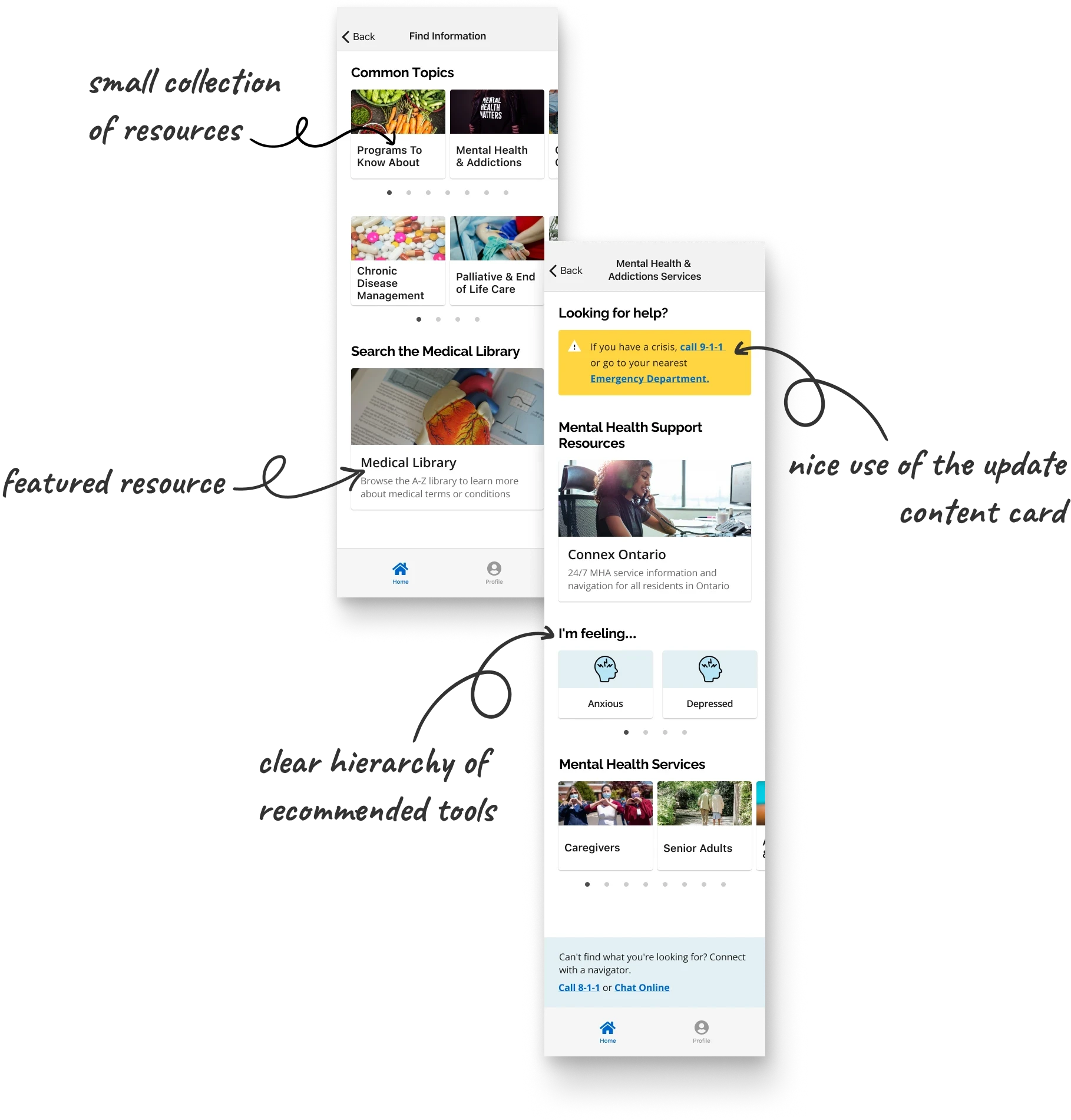


Finding information, resources, and services: Organizing collections of important features.
Finding information, resources, and services: Organizing collections of important features.
They were also able to organize and display a large collection of resources and services without overwhelming the page.
They were also able to organize and display a large collection of resources and services without overwhelming the page.

An Epilogue
An Epilogue
An Epilogue


Level-up: Lessons for future experiences
Level-up: Lessons for future experiences
Level-up: Lessons for future experiences
In a future iteration, I would organize the components into a formal design system
In a future iteration, I would organize the components into a formal design system
This was the first time the IDENTOS Design Team established a design system of standardized, reusable components. With what I know now, I would have:
This was the first time the IDENTOS Design Team established a design system of standardized, reusable components. With what I know now, I would have:
01
01
Considered a naming convention for referencing the components; and
Considered a naming convention for referencing the components; and
02
02
Created a guide on best practices for organizing components, including layout examples to prevent cluttered Navigators, ensuring good information architecture principles are upheld.
Created a guide on best practices for organizing components, including layout examples to prevent cluttered Navigators, ensuring good information architecture principles are upheld.


You can’t predict every single use case—that's okay
You can’t predict every single use case—that's okay
Designing a perfect system for every use case isn’t cost-effective or efficient, especially for an older product. Instead, it's more practical to use current information about clients and their customers as a basis for improvements.
Designing a perfect system for every use case isn’t cost-effective or efficient, especially for an older product. Instead, it's more practical to use current information about clients and their customers as a basis for improvements.

Too many options is no option at all
Too many options is no option at all
While the design system needs flexibility, setting limits on what can be configured often fosters creativity and reduces overwhelm for designers.
While the design system needs flexibility, setting limits on what can be configured often fosters creativity and reduces overwhelm for designers.


Read another case story?
Read another case story?
Read another case story?


